Card with Dark Mode
For blog post and e-commerce websites
This tailwind example is contributed by OmKar Mehta, on 10-Jun-2024. Component is made with Tailwind v3.4. It is responsive. It supports dark mode.

Related Examples
-
 Trending Creators
Trending Creators
-
 Card KPI
Targetas ahora con un grafico
-
 1.7k
1.7k -
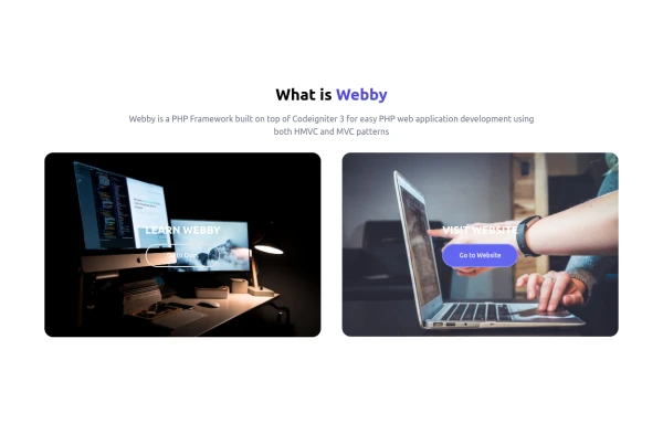 What is Webby
Webby is a PHP Framework built on top of Codeigniter 3 for easy PHP web application development using both HMVC and MVC patterns.
2.6k -
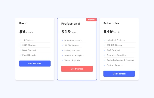 Interactive Pricing Cards
this are pricing cards
1.7k -

-
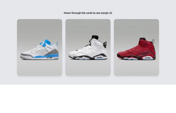 Amazing E-commerce card 2
An amazing e-commerce card with stunning hover effect 2
2.3k -
 3.3k
3.3k -

-
 Premium High-Performance Web Gaming Hub
Experience the future of browser-based gaming. I’ve developed a premium arcade hub designed for speed, clarity, and zero-latency gameplay. Built with modern web technologies, Ayyamperumal Games brings AAA-inspired visuals and high-octane mechanics directly to your browser—no downloads, no lag, just pure performance. Explore a curated library of titles ranging from minimalist logic puzzles like Sudoku Elite to fast-paced action in Neon Drift. This is where clean code meets high-level entertainment.
947 -
 Code Editor UI
Simple code editor prototype made with HTML and TailwindCSS. A lightweight template to explore and customize.
1k -





Browse by topic
Explore components by Tags
Jump straight to the UI pattern you need.
Can't find it?
Didn't find the component you were looking for?
Search across 3,000+ community-built components and grab the code in seconds.