Simple card layout with image
This tailwind example is contributed by Leon Bachmann, on 30-Nov-2022. Component is made with Tailwind v3.4.

Related Examples
-
 Card with image full width
This component is a card designed for showcasing featured blog posts. It includes the post title, a captivating image, category links, and author details.
14.1k -

-
 10.9k
-

-
 test deepseek ticket
-
 Profile Card with Transparent
Dynamic Background: Darker gradient background for better contrast Floating colored blobs for visual interest Profile Image Glow: Added a gradient glow effect behind the profile picture Smoother hover transition Typography Improvements: Larger, bolder name text Subtle hover underline animation for the name Better spacing and hierarchy
1.5k -
 Premium Tailwind CSS Card Component
Discover this elegant premium card component built with Tailwind CSS featuring the Poppins font. This modern, responsive design features glassmorphism effects, gradient borders, smooth animations, and a sophisticated color scheme, making it ideal for showcasing premium products or services.
1.1k -
 The Future of Web Development
love my product
-
-
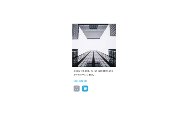 A product card with size selector
Using alpine it shows a size selector when clicking in cart
2.1k -

-



Browse by topic
Explore components by Tags
Jump straight to the UI pattern you need.
Can't find it?
Didn't find the component you were looking for?
Search across 3,000+ community-built components and grab the code in seconds.