Amazon shopping buy now button
Amazon shopping buy now button
This tailwind example is contributed by OmKar Mehta, on 26-Jun-2024. Component is made with Tailwind CSS v3. It is responsive.

Author OmKar Mehta
Related Examples
-
 1 year ago1k
 -
 1 year ago2.5k
 -
 Continue with Social Login - Continue with Google, LinkedIn, Twitter, Facebook, GitHub, Apple
Streamline your account creation and login process. Use our secure social login buttons to quickly sign in or register using your existing Google, LinkedIn, Twitter, Facebook, GitHub, or Apple account.
4 months ago382 -
 2 years ago13.2k
 -
 Animated button
on hover underline will go from left to right
1 year ago5.3k -
 3 years ago16.1k
 -
Gradient Button
These buttons use a style that includes two contrasted colors creating an impressive mesh gradient effect.
1 year ago4.4k -
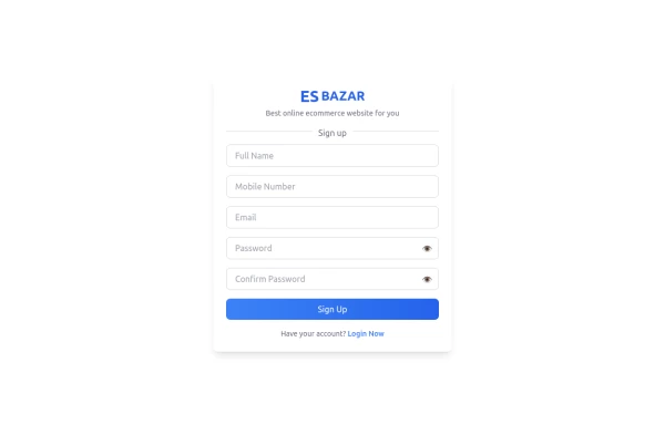 Responsive Sign-Up Form with TailwindCSS
Create a visually appealing and fully responsive sign-up form using TailwindCSS. This form includes input fields for full name, mobile number, email, password, and confirm password, along with a gradient sign-up button. Designed with simplicity and flexibility, it is perfect for modern web applications and easy to integrate into any project.
1 year ago1.5k -
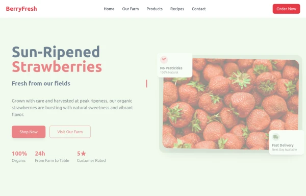 strawbery
by salvator
9 months ago906 -
 Social buttons
Mono-color Social buttons change colors according to your need
3 years ago12.2k -
 Call to action buttons
Pair of active primary and secondary buttons. Elevated buttons w/ border bottom
2 years ago9.8k -
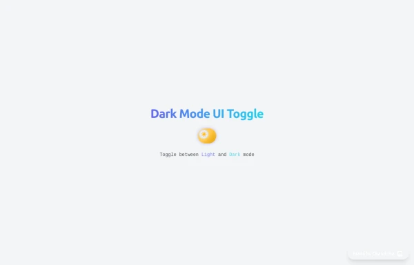 Animated Light/Dark Mode Toggle
👉🏻3D glow effects on knob & track 👉🏻Gradient transitions that look holographic 👉🏻Animated pulse when active 👉🏻Dark background gradient instead of a flat color 👉🏻Emoji swap (☀️ → 🌙)
4 months ago411


Explore components by Tags
Didn't find component you were looking for?
Search from 3000+ components