Button with hover animation
This tailwind example is contributed by Andrew, on 03-Feb-2025. Component is made with Tailwind CSS v3. It is responsive.

Author Andrew
Related Examples
-
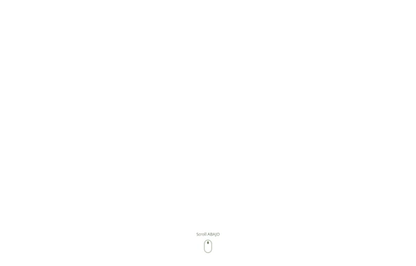 SCROLL ABAJO
para poner que a llegado al final de la pagina
7 months ago964 -
 Previous Next Buttons
Pagination buttons
3 years ago14.5k -
 1 year ago2.7k
 -
Canlı Yayın Butonu
Pulse efekt içeren canlı yayın butonu.
1 year ago1.9k -
Beautiful animated button
on hover effect
1 year ago5.2k -
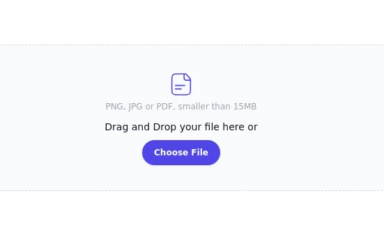 File Input
File Input
1 year ago2.7k -
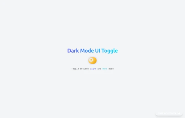 Animated Light/Dark Mode Toggle
👉🏻3D glow effects on knob & track 👉🏻Gradient transitions that look holographic 👉🏻Animated pulse when active 👉🏻Dark background gradient instead of a flat color 👉🏻Emoji swap (☀️ → 🌙)
5 months ago424 -
Button wih hover gradient
Works well with the dark theme
2 years ago18.3k -
 3 months ago423
 -
 Buttons - Htmlwind
Primary buttons
9 months ago684 -
 3 years ago11.1k
 -
 Github stars button
Display the GitHub stars received by your project
2 years ago9k


Explore components by Tags
Didn't find component you were looking for?
Search from 3000+ components