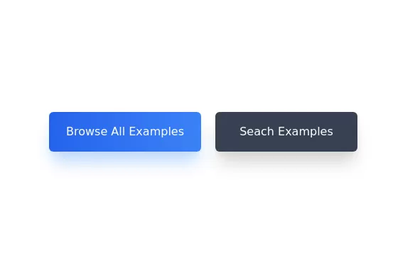
Call to action buttons
Pair of active primary and secondary buttons.
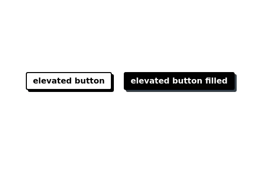
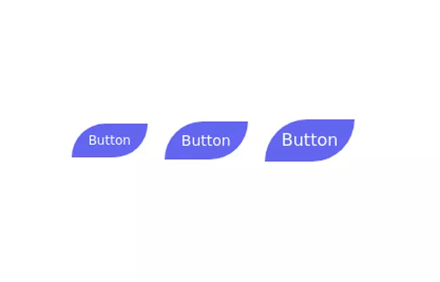
Elevated buttons w/ border bottom
This tailwind example is contributed by Hyun-woo Cho, on 08-Oct-2023. Component is made with Tailwind CSS v3. It is responsive. It supports dark mode.

Author Hyun-woo Cho
Related Examples
-
 3 years ago14.6k
 -
 3 years ago12.4k
 -
 Buttons popup on hover
Popup buttons on hover
3 years ago14.5k -
 3 years ago10.1k
 -
 Button with hover to button shadow
A beautiful button with a special shadow
1 year ago1.6k -
 1 year ago3.3k
 -
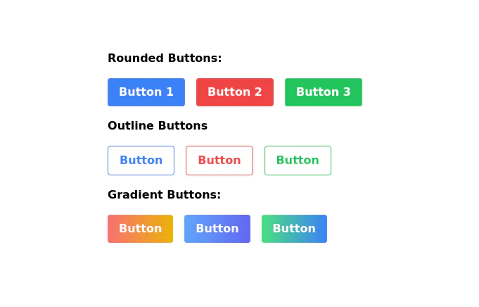
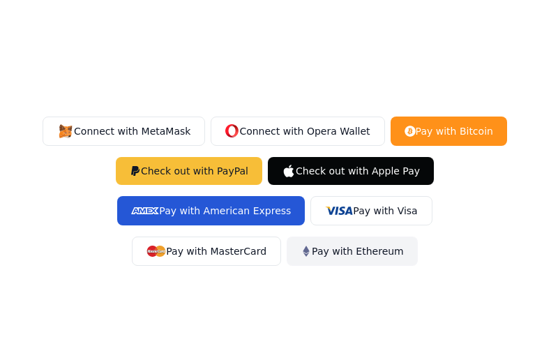
 Neo-Brutalism UI Button Collection - Bold CSS Button Styles withTailwind CSS
Bold, chunky neo-brutalism buttons with thick borders and strong shadows for modern web design. Explore our collection of vibrant, high-contrast CSS buttons with hover effects and dark mode support.
3 months ago501 -
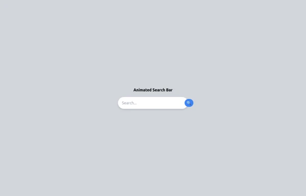 Animated Search bar
Animated Search bar using tailwind
9 months ago1k -
 Premium Gaming UI Card, Form & Animated Button (Tailwind CSS)
A modern, senior-level gaming UI built with Tailwind CSS focusing on spacing, typography, and calm visual hierarchy rather than noisy effects. This component set includes: A premium gaming card with clear content structure and outcome-focused copy A clean player signup form with accessible focus states and minimal visual noise A custom animated button using a restrained light-sweep effect for premium interaction feedback Designed to resemble real production gaming platforms rather than demo or template UI. Fully responsive, copy-paste ready, and easy to extend for real-world projects.
2 months ago165 -
 3 years ago12k
 -
 Premium Button Collection with 12 Unique Animations
Collection de 12 boutons premium avec animations uniques : glow, shine, slide, 3D push, neon pulse, glassmorphism, gradient border et plus. Chaque bouton a son propre effet hover. 100% Tailwind CSS, no JavaScript.
3 months ago316 -
 Image Card
An image. Shows title and description info when hovering. Image zooms and darkens when hovering.
10 months ago833


Explore components by Tags
Didn't find component you were looking for?
Search from 3000+ components