sdebar simple
sdebar simple
This tailwind example is contributed by Omer fils ELENGA, on 07-Mar-2026. Component is made with Tailwind v3.4. It is responsive. similar terms for this example is drawer

Related Examples
-
 Responsive navbar with alpinejs
A mix of Penguin navbar with PineUI Slide-Over
-
-

-
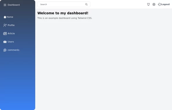 Tailwind Sidebar Layout
Place edited for the search button
-
 Sidebar
This is the sidebar that I use in my projects, I use grid to be able to manage the space issue a little better, it seems like a clean and modern design, it is more than anything for the dashboards that you want to create
4.7k -
 Responsive navbar with dark mode support
Sidebar on small screen devices
-
 Growing Navigation Menu with Tailwind CSS
PREVIEW ON FULL SCREEN BECAUSE INSIDE THE NAV BAR IT CONTAINS (aria-current="page") which create some issues inside canvas. A clean and minimal vertical navigation menu built with Tailwind CSS featuring smooth line expansion, hover interactions, and active link highlighting. The component uses lightweight CSS transitions with aria-current support for accessible active states, making it ideal for documentation websites, portfolios, dashboards, and landing pages.
272 -
 Sticky Navbar
A modern, feature-rich, and fully responsive navigation bar built with Tailwind CSS. This premium navbar includes a top contact bar, multi-level mega menus, live search with suggestions, mobile drawer navigation, nested accordion menus, authentication buttons, sticky header, and smooth interactions. Perfect for SaaS, corporate, startup, agency, eCommerce, legal, education, and business websites.
283 -
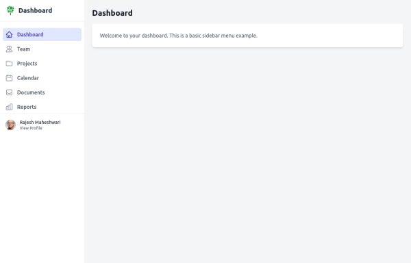
 sidebar responsive
responsive sidebar with working links
1.3k -
-

-
 Sidebar
This HTML file includes: 1. A responsive sidebar with 3D animation effects: 1. The sidebar slides in and out smoothly. 2. Navigation items have a 3D hover effect using CSS transforms and transitions. 2. Tailwind CSS for styling: 1. Included via CDN for easy setup. 2. Used for layout, colors, and basic styling. 3. Custom CSS for animations and 3D effects: 1. Keyframe animations for sidebar open/close. 2. 3D transform effects for nav items. 4. JavaScript for interactivity: 1. Toggles the sidebar open and close. 2. Adds 3D effect to nav items on hover using mouse position. 3. Closes the sidebar when clicking outside. 5. Accessibility features: 1. ARIA label for the toggle button. 2. Keyboard navigation support (Enter/Space to toggle sidebar). 3. Focus trapping within the sidebar when open. 6. Responsive design: 1. The sidebar is full-height and toggleable, suitable for both desktop and mobile views. This implementation provides a visually appealing sidebar with 3D animations and effects, while maintaining accessibility and responsiveness. It uses HTML for structure, Tailwind CSS for styling, and vanilla JavaScript for interactivity, as requested.
2.7k


Browse by topic
Explore components by Tags
Jump straight to the UI pattern you need.
Can't find it?
Didn't find the component you were looking for?
Search across 3,000+ community-built components and grab the code in seconds.