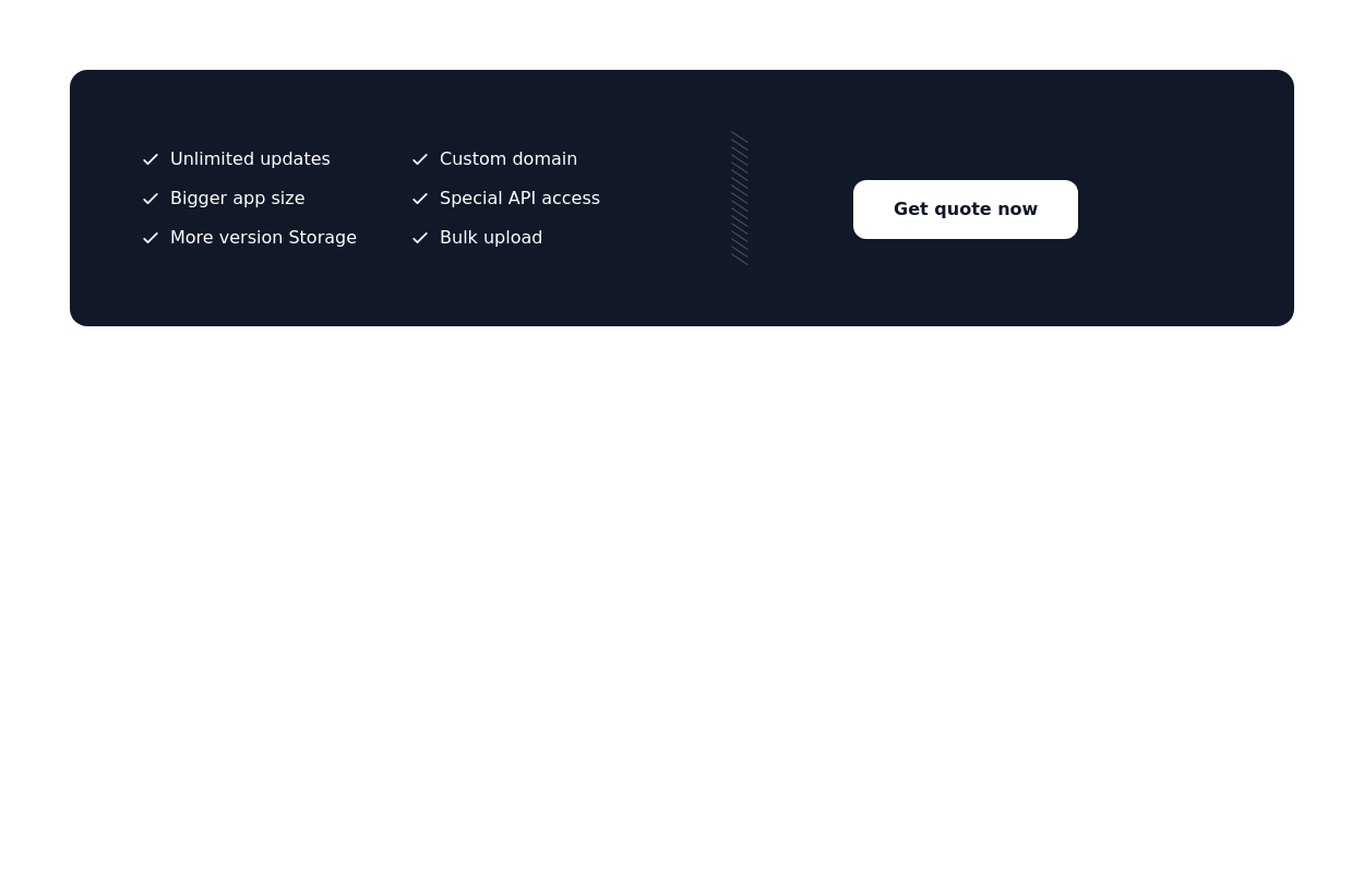
Call to action
Call to action section. find it makecomponents.com
This tailwind example is contributed by makecomponents, on 03-Sep-2024. Component is made with Tailwind CSS v3. It is responsive. similar terms for this example are CTA,banner

Author makecomponents
Related Examples
-
 2 years ago12.5k
 -
 1 year ago1.3k
 -
 3 years ago14.1k
 -
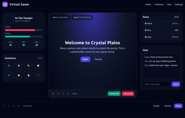 asimple game lay out
asimple game lay out
6 months ago900 -
 Domain For Sale Template
Domain For Sale Template
2 years ago4.3k -
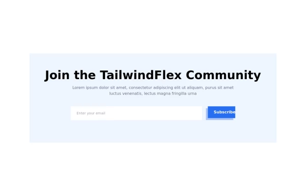 Modern responsive Newsletter form
Responsive newsletter subscriber form
1 year ago3k -
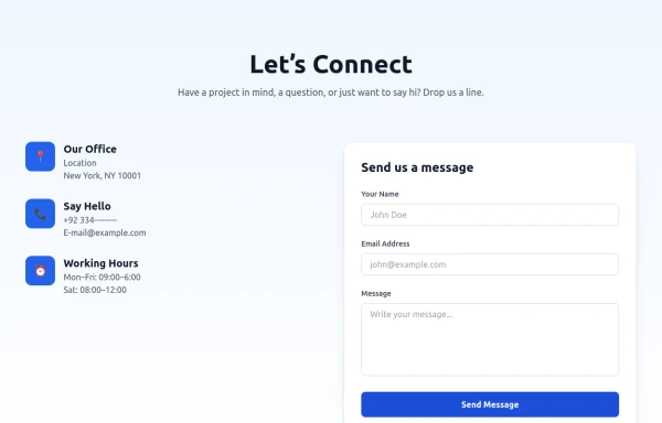 Modern Contact Section with Responsive Grid and Glassmorphic Form
A clean, professional contact section with a dual-column layout featuring contact details and a sleek glassmorphism-inspired form. Fully responsive with Tailwind CSS, supporting both light and dark modes.
8 months ago681 -
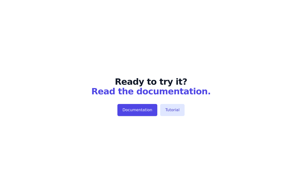
 CTA banner
With fading bg gradient
1 year ago1.4k -
 1 year ago2.3k
 -
 3 years ago15.4k
 -
 3 years ago9.8k
 -
 Basic CTA
Simple and straightforward call to action section
2 years ago7.8k


Explore components by Tags
Didn't find component you were looking for?
Search from 3000+ components