onlinee
examination
This tailwind example is contributed by Nezerwa Debora, on 28-May-2025. Component is made with Tailwind CSS v3. It is responsive.

Author Nezerwa Debora
Related Examples
-
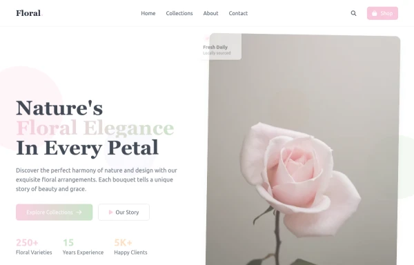 flower
by salvator
9 months ago1.3k -
 Hero Section>> visually striking and incorporates some different elements.
Key features of this alternative hero section: 1. Background: - Uses a gradient overlay on top of a background image for depth. - Incorporates a semi-transparent dark overlay for better text contrast. 2. Layout: - Maintains a two-column layout on larger screens, stacking on mobile. - Left side focuses on a bold, three-line tagline and concise description. - Right side features a glassmorphic card with key selling points. 3. Design Elements: - Uses a custom Google Font (Poppins) for a modern look. - Incorporates rounded buttons with hover effects. - Features colorful icons for the selling points. - Adds a decorative wave SVG at the bottom for visual interest. 4. Responsiveness: - Adjusts padding, font sizes, and layout for different screen sizes. - Stacks buttons vertically on very small screens. 5. Interactivity: - Includes hover effects on buttons and links. This design aims to create a more visually impactful first impression while still maintaining clarity and focus on the key messages and call-to-action elements. The use of a background image with overlays adds depth, while the glassmorphic card on the right adds a modern touch. You can further customize this by: - Changing the background image URL to one that fits your brand. - Adjusting colors in the gradient, buttons, and icons to match your brand colors. - Modifying the tagline, description, and selling points to fit your company's message. Would you like me to explain any part of this code or make any further adjustments?
1 year ago5.3k -
 3 years ago13.1k
 -
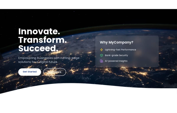
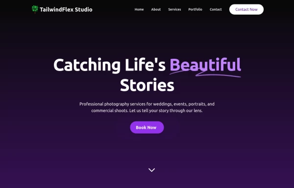
 Hero $ Navigation
This is a modern, AI-focused landing page for a company called NEURALCORE that offers enterprise-grade AI solutions.
9 months ago1.1k -
 DailyDev Card
Card -based card used in the Dailydev Card, this is created to be modified to taste of each user
1 year ago1.8k -
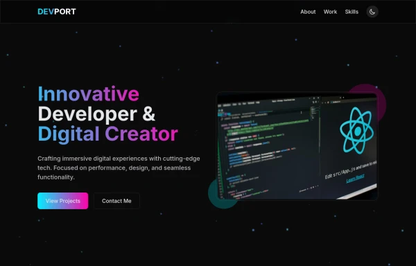 DevPort
modern portifolio by salvator
9 months ago1.2k -
 Product Page
Showcase for the product.
1 year ago2.5k -
 2 months ago206
 -
 1 year ago6k
 -
 1 year ago4.2k
 -
 1 year ago1.2k
 -
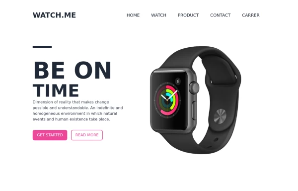
 Hero section
Beatiful landing page hero section
1 year ago2.3k


Explore components by Tags
Didn't find component you were looking for?
Search from 3000+ components