Standard Hero
This tailwind example is contributed by Anonymous, on 09-Mar-2024. Component is made with Tailwind CSS v3. It is responsive. It supports dark mode.

Author Anonymous
Related Examples
-
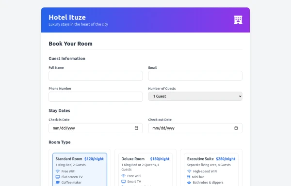 booking room or chamber
reflesh, freedom,sleeping,good vibes, etc.........
5 months ago668 -
 Flour mill website landing page template
flour mill and services template website which comprise of many sections like about us, featured products, why us, visit us
1 year ago13.8k -
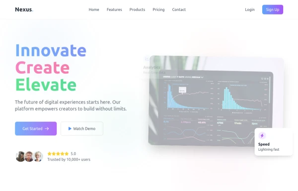
 Modern SAAS Hero Section
A 2-column responsive hero section for modern SAAS APP
1 year ago4.7k -
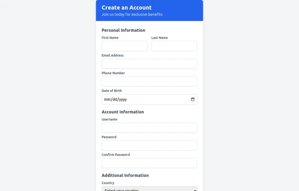 Registration
used in personal information
5 months ago776 -
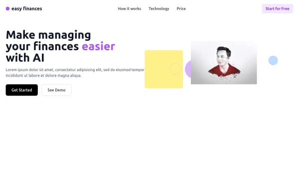 Managing Finance Hero
Create a modern and responsive Hero Section using TailwindCSS. This section features a bold headline, a subheading, and a call-to-action button, designed to grab user attention instantly. With a clean layout, engaging typography, and a visually appealing background, this hero section enhances the first impression of your website. Ideal for landing pages, e-commerce, and SaaS platforms, it ensures a seamless experience across all devices.
8 months ago863 -
 Modern page
hero page by salvator
5 months ago921 -
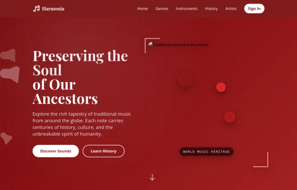 tradition music
by salvator
5 months ago607 -
 tiket token
enter in stadium using tecinology
5 months ago785 -
 Hero with SVG background
It has a nice 'Sign Up with Google' CTA button
1 year ago2.1k -
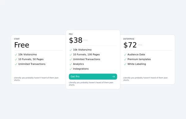 Tailwind Pricing Section 2
Fully Responsive Pricing Section
1 year ago1.9k -
 3 years ago14.9k
 -
 3 years ago20.9k


Explore components by Tags
Didn't find component you were looking for?
Search from 3000+ components