Green and blue gradient
This tailwind example is contributed by Mohit Prajapati, on 13-Mar-2023. Component is made with Tailwind CSS v3.

Author Mohit Prajapati
Related Examples
-
 3 years ago14.9k
 -
 3 years ago13.2k
 -
 3 years ago9.5k
 -
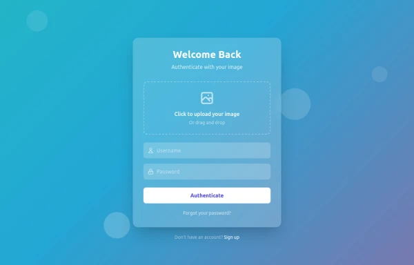 FacePass: Animated Image Authentication
"Where your image becomes your key" "Biometric meets beautiful animations" "A login experience that recognizes you – literally" "Security through personalized visual authentication" "Your face, animated, authenticated"
9 months ago1.1k -
Gradient Button
These buttons use a style that includes two contrasted colors creating an impressive mesh gradient effect.
1 year ago4.4k -
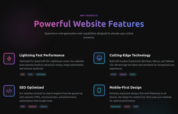 Powerful Website Features
Open Layout Design: No traditional boxes - content flows naturally Gradient Accents: Vibrant color gradients for visual interest Animated Icons: Subtle floating animations on feature icons Hover Effects: Soft glow backgrounds appear on hover Tag System: Color-coded tags for each feature's attributes Dark Theme: Sophisticated dark background with perfect contrast
8 months ago1.2k -
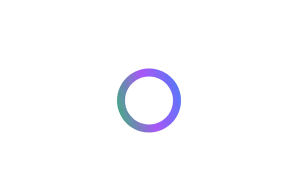
 color blur
blur
1 year ago1.8k -
 2 years ago8.1k
 -
 3 years ago13.7k
 -
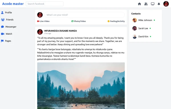
 Acode master
Acode master(=>good work for Acode master)
9 months ago878 -
 SocialSphere: A Full-Stack Social Media Platform
SocialSphere is a full-stack social media platform inspired by Facebook, built using HTML CSS
9 months ago973 -
 Modern Responsive Footer with Tailwind CSS
This sleek and modern responsive footer is built using HTML and Tailwind CSS. It features three sections: brand information, useful links, and social media icons. The footer includes smooth hover effects, subtle fade-in animations, and a fully responsive design that adapts seamlessly to different screen sizes. Perfect for websites looking for a professional and stylish footer section.
1 year ago2.1k


Explore components by Tags
Didn't find component you were looking for?
Search from 3000+ components