Basic CTA section
This tailwind example is contributed by Lîmåã M, on 17-Jun-2023. Component is made with Tailwind CSS v3. It is responsive. similar terms for this example are CTA,banner

Author Lîmåã M
Related Examples
-
 Clean & Responsive Footer Design with Tailwind CSS With CTA Button
modern and responsive footer built with Tailwind CSS to enhance website navigation, accessibility, and user experience. Featuring quick links, social media icons, copyright info, and a sleek layout, this SEO-friendly footer improves engagement and usability across all devices. Perfect for portfolios, business websites, and eCommerce stores!
11 months ago1.1k -
 Beautiful CTA w/ large buttons
This CTA card also has a features list
2 years ago2.6k -
 11 months ago2.3k
 -
 3 years ago6.9k
 -
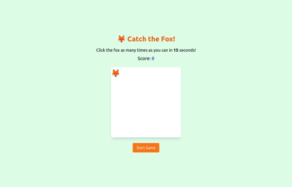 an off line game of catching afox
an off line game of catching afox
9 months ago785 -
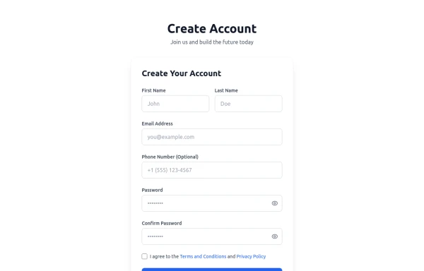 Registration Form with Validation & Success State
A modern and interactive registration form built using Tailwind CSS and Alpine.js, designed for seamless user onboarding with real-time validation and elegant animations. This component includes client-side form validation, dynamic password visibility toggles, and a success confirmation screen with personalized feedback. It’s fully responsive, dark mode–ready, and styled for modern SaaS or startup platforms. ✨ Key Features 🧠 Real-time input validation for required fields (name, email, password, etc.) 🔒 Show/hide password toggle with animated SVG icons ✅ Success message with user details after submission 💨 Animated transitions using Alpine.js 🌙 Dark mode and light mode compatible 📱 Fully responsive across all screen sizes 🧩 Built with pure Tailwind CSS and Alpine.js (no external libraries) 💡 Perfect for: Registration or sign-up pages SaaS onboarding flows Portfolio or agency login systems Form validation demos or UI component libraries
4 months ago290 -
 2 years ago12.9k
 -
 3 years ago14.3k
 -
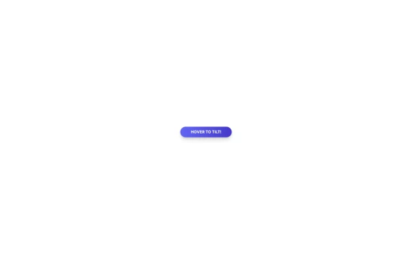 Tilted button on hover.
A simple button with a gradient and tilt on hover. Dark mode supported with same color.
11 months ago981 -
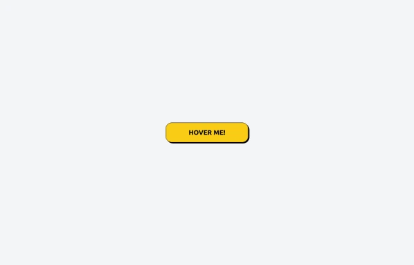
 Call to Action
CTA with Dark and Shadow colors
8 months ago1.2k -
 1 year ago2.7k
 -
 Tailwind CSS Button (Wavy Button)
The button uses Tailwind classes for size, background, border, border-radius, shadow, cursor, overflow, and transitions. The wave overlay is absolutely positioned at the bottom of the button, initially off-screen (top-full) and moves to the middle (top-1/2) on hover via the custom .wave class and keyframes. The font-poppins class isn’t a default Tailwind class. You should define it in your Tailwind configuration or replace it with font-sans if you haven't extended fonts.
8 months ago953


Explore components by Tags
Didn't find component you were looking for?
Search from 3000+ components