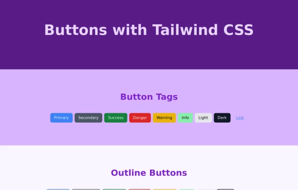
Buttons examples
This tailwind example is contributed by Manuela Bianka, on 17-Jan-2023. Component is made with Tailwind CSS v3.

Author Manuela Bianka
Related Examples
-
3 years ago16.3k
-
 3 years ago10.2k
 -
Color changing button
changes the color of a button automatically and continuously
2 years ago8.6k -
 🔥 Sleek & Modern Button with Hover Effect – Tailwind CSS
A beautifully designed button using Tailwind CSS, featuring smooth transitions, a bold shadow effect, and a hover animation. Styled with custom colors, rounded edges, and a modern font, this button is perfect for call-to-action (CTA) elements in your website or app. 🚀
1 year ago893 -
 3 years ago10.8k
 -
 Exapnd and collapse button for large content without javascript
Truncate and expand on click large content without using JavaScript.
1 year ago2.3k -
Elevated Buton
On hover merge shadow
1 year ago2.6k -
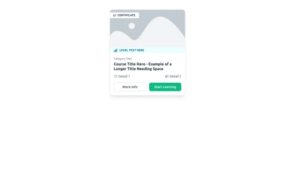 E-Learning Course Card with Badge and Level Indicator
An HTML and Tailwind CSS component mockup for displaying course information. Features include a placeholder image area with an overlaid certificate badge, a distinct level indicator banner below the image, category text, a course title, key details (like duration and learner count placeholders), and primary/secondary action buttons. Designed for e-learning platforms or course listings.
11 months ago1.1k -
 3 years ago10.6k
 -
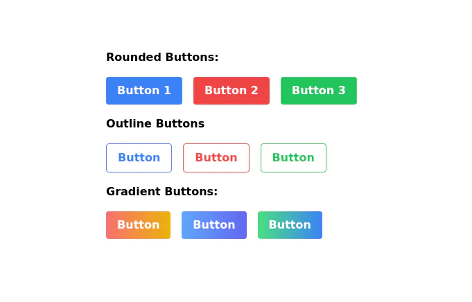
 Tailwind Different Button Styles
Fully Responsive Buttons
1 year ago2.5k -
Background Gradient Button with Hover Effects
The button designed with a gradient background that transitions smoothly between three colors
2 years ago8.2k -
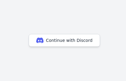 Continue with Discord button
Login with the Discord button for social login
2 years ago13k


Explore components by Tags
Didn't find component you were looking for?
Search from 3000+ components