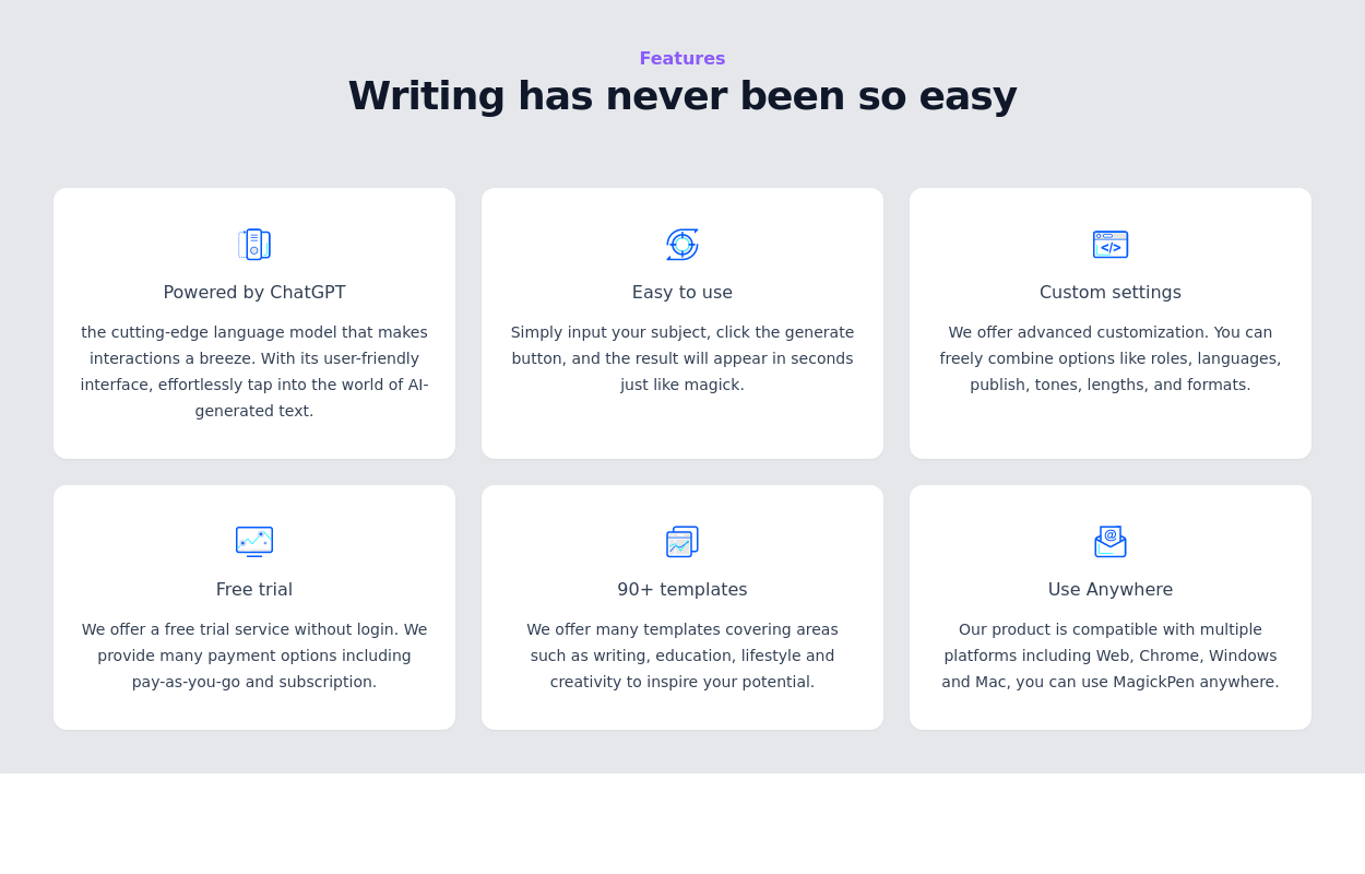
Tailwind responsive features card grid
with gradient background
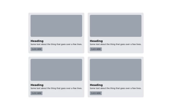
This tailwind example is contributed by Kofi Osei, on 13-Mar-2023. Component is made with Tailwind CSS v3. It is responsive.

Author Kofi Osei
Related Examples
-
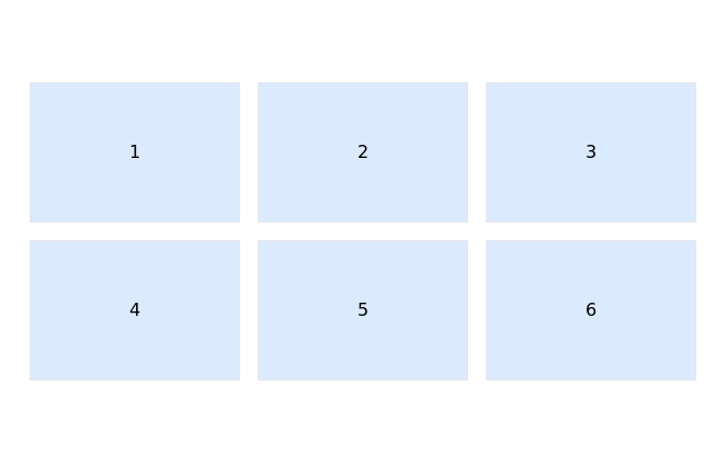
 Responsive products grid
Responsive product card grid using tailwind CSS.
3 years ago44.9k -
 2 years ago14.5k
 -
 Tailwind image gallery
Responsive grid with evenly spaced image cards. Each card has a title label at the bottom, and there's a subtle hover effect for interactive engagement.
3 years ago61.1k -
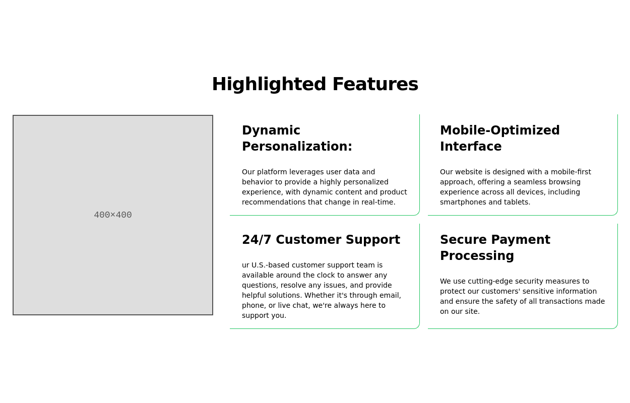
 Features section
Showcase your key features
3 years ago16.8k -
 Responsive Hero Section with Typewriter Effect
A modern hero section featuring a typewriter animation effect, social media links, and responsive design. Includes a user avatar placeholder and a clean dark gradient background. Built with Tailwind CSS and Font Awesome icons. Perfect for personal portfolio websites.
11 months ago668 -
 3 years ago13.3k
 -
 Card
Cardtravel place card hover effect card
1 year ago2.1k -
 11 months ago917
 -
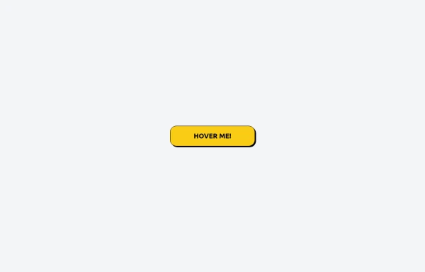 Tailwind CSS Button (Wavy Button)
The button uses Tailwind classes for size, background, border, border-radius, shadow, cursor, overflow, and transitions. The wave overlay is absolutely positioned at the bottom of the button, initially off-screen (top-full) and moves to the middle (top-1/2) on hover via the custom .wave class and keyframes. The font-poppins class isn’t a default Tailwind class. You should define it in your Tailwind configuration or replace it with font-sans if you haven't extended fonts.
8 months ago952 -
 1 year ago2.6k
 -
 3 years ago15.5k
 -
 3 years ago11.1k


Explore components by Tags
Didn't find component you were looking for?
Search from 3000+ components