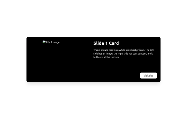
Sticky fullpage pages / slides

This tailwind example is contributed by Hasan AlDoy (McDoy), on 20-Jan-2025. Component is made with Tailwind CSS v3. It is responsive.

Related Examples

  • Calculator

    This calculator uses CSS although it can be passed directly to tailwind

    1.5k
  • Services

    This Services page design includes: 1. Responsive layout using Tailwind CSS grid system 2. Indigo-800 and Blue-900 color scheme 3. Dark mode support 4. Header with navigation 5. Six service cards with icons, titles, and descriptions 6. Footer with copyright information 7. Subtle animations and transitions 8. Accessibility considerations (proper heading structure, color contrast) Key features: - The background uses a gradient from Indigo-800 to Blue-900 - The header and footer have a white background in light mode and dark gray in dark mode - Service cards have a white background in light mode and dark gray in dark mode - Text colors are adjusted for readability in both light and dark modes - Icons use the Indigo-800 color (Indigo-400 in dark mode) for consistency - Each service card has a hover effect that scales it up slightly - Service cards fade in with a staggered delay for a smooth entrance - Dark mode is automatically applied based on system preferences - The design is fully responsive, adjusting from 1 to 3 columns based on screen size This design provides a clean, professional look for a services page while incorporating the requested color scheme and maintaining good usability across different devices and color modes.

    1.2k
  • Multi-Step Form Wizard

    Working Multi-Step Form more complex forms. made with tailwind CSS v3 and javascript

    3.8k
  • google clone page

    This HTML page includes: The Google logo with the correct colors A search input field with microphone and camera icons "Google Search" and "Win Freeing Lucky" buttons The text "With new The ZGS Breakthrough Plus cabinets today's where business ?" Footer with all the links shown in the image: Advertising, Business, New Search works, Privacy, Terms, Settings The climate action text in the footer The layout is responsive and uses Tailwind CSS for styling. The colors match Google's brand colors, and the overall structure matches what's shown in the image.

  • Progress bar with Tailwind CSS and Javascript

    How to a create a scroll progress bar with Tailwind CSS and Javascript

  • Modern Responsive Footer with Tailwind CSS

    This sleek and modern responsive footer is built using HTML and Tailwind CSS. It features three sections: brand information, useful links, and social media icons. The footer includes smooth hover effects, subtle fade-in animations, and a fully responsive design that adapts seamlessly to different screen sizes. Perfect for websites looking for a professional and stylish footer section.

  • Skills Showcase, My Tech Stack and Expertise & Skills

    🚀 Showcasing My Skills with TailwindCSS & Flexbox! I’ve designed a responsive and interactive Skills Section using Tailwind CSS and Flexbox. With smooth hover effects and a clean layout, this section highlights my expertise in: 🔹 Frontend Technologies – HTML, CSS, JavaScript, React, Next.js 🔹 Styling Frameworks – TailwindCSS 🔹 Backend & Tools – Node.js, Git

Explore components by Tags

Didn't find component you were looking for?

Search from 2100+ components

tailwindflex logo TailwindFlex.com
Tailwindflex.com is a free Tailwind CSS examples library. It's a one-stop destination for ready-made Tailwind CSS components and templates.

Contact

© 2025 TailwindFlex. All Rights Reserved.

v1.1