- Home
-
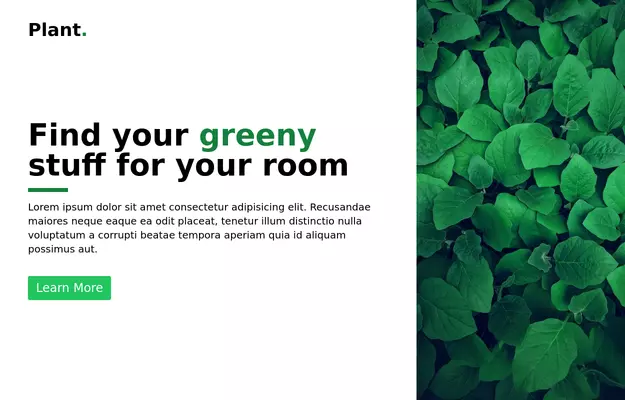
Hero section with background gradient
Hero section with background gradient
This tailwind example is contributed by Freja Jensen, on 04-Jan-2023. Component is made with Tailwind CSS v3. It is responsive.
Author Freja Jensen
Related Examples
-
3 years ago13.1k
-
Hero section with a gradient background
With text overlay, and a call-to-action button
2 years ago20.3k -
3 years ago15.5k
-
3 years ago16.1k
-
3 years ago17.1k
-
3 years ago22k
-
1 year ago1.5k
-
Modern CV Template - Stylish HTML and Tailwind CSS Design for Professionals
Download this modern CV template crafted with HTML and Tailwind CSS. Featuring a clean, stylish design and easy customization, this CV template is perfect for professionals looking to make a strong impression. Showcase your skills, experience, and education with a visually appealing and responsive layout.
1 year ago3.2k -
Macbook Air 13" Mockup
A gorgeous component that can be used for landing pages, hero statements and more. Interested in our UI library? Check out the discord link in my bio.
1 year ago2.4k -
11 months ago2.2k
-
heroimage
svg and hero image, basic html code
8 months ago642 -
2 months ago252
Explore components by Tags
Didn't find component you were looking for?
Search from 3000+ components
