Steps -4
This tailwind example is contributed by farisubuntu, on 17-Aug-2024. Component is made with Tailwind CSS v3. It is responsive. It supports dark mode. similar terms for this example are loading, loader

Author farisubuntu
Related Examples
-
3 years ago18.6k
-
Button With Loader
Tailwind Loader
1 year ago3k -
 1 year ago1.3k
 -
 1 year ago2.2k
 -
 Spinner
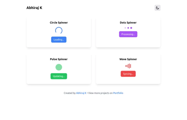
The Spinner is a simple and visually appealing component that indicates ongoing processes like loading or data fetching. It's a great way to improve user engagement and reduce frustration during wait times. Different styles and animations (circular, dots, pulsating). Customizable size, color, and speed. Easy to integrate with loading states in any app. Lightweight and responsive.
1 year ago2.2k -
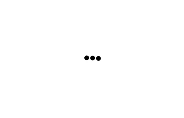 Loading dots
Black Loading dots
1 year ago1.9k -
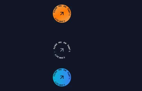 Contact Spinner
Contact button spinning
1 year ago5.7k -
 Skeleton Loader
The Skeleton Loader is a placeholder component that creates a smooth loading animation to mimic the layout of the actual content. It enhances user experience by setting clear expectations during data loading. Supports different shapes (rectangles, circles, etc.). Adjustable sizes and durations for animation. Works well with dynamic content such as cards, text, or images. Highly customizable and responsive.
1 year ago2.3k -
 Tailwind Spinner(Loader)
simple and precise
2 years ago9.6k -
Animated Title
App Logo or Main Title
2 years ago7.1k -
 Your Creative Login Page
"Animated Image Login UI" "Tailwind Image Login with Animated Background" "Innovative User Login Experience" "Creative Bubble Background Login" "Login with Personality — Featuring Your Image" "Acode Master Animated Login" ✅ (customized for you)
9 months ago859 -
 1 year ago1.7k


Explore components by Tags
Didn't find component you were looking for?
Search from 3000+ components