Steps -2
This tailwind example is contributed by farisubuntu, on 17-Aug-2024. Component is made with Tailwind CSS v3. It is responsive. similar terms for this example are loading, loader

Author farisubuntu
Related Examples
-
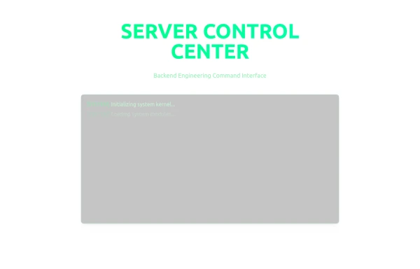 Server Control Center
Server Control Center
6 months ago727 -
 2 years ago12.4k
 -
3 years ago10.8k
-
3 years ago16.5k
-
 3 years ago13.7k
 -
 Loading Overlay
Add loading overlay to your divs
3 years ago24.8k -
3 years ago18.6k
-
 3 years ago28k
 -
3 years ago10.4k
-
 Loader
A small, minimal animated loader using Tailwind CSS and Flexbox for clean, centered loading states.
2 months ago170 -
 3 years ago13.1k
 -
3 years ago16.3k


Explore components by Tags
Didn't find component you were looking for?
Search from 3000+ components