- Home
 - 
                    Contact Spinner
 
Contact Spinner
Contact button spinning
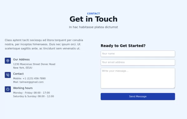
This tailwind example is contributed by $@(\/)(\/)¥, on 28-Mar-2024. Component is made with Tailwind CSS v3. It is responsive. It supports dark mode. similar terms for this example are Get in touch, Contact form,loading, loader
Author $@(\/)(\/)¥
Related Examples
- 
    
    
    Beautiful animated button
on hover effect
1 year ago4.9k - 
    
    
    2 years ago40.9k
 - 
    
    
    Button With Loader
Tailwind Loader
1 year ago2.6k - 
    
    
    3 years ago19.2k
 - 
    
    
    Contact us form
Contact us form
1 year ago5.9k - 
    
    
    macOS Style Webpage – macOS Design in the Browser
A simple webpage inspired by the macOS interface. It recreates the clean design, dock, and desktop look of macOS using only HTML, tailwind CSS, and JavaScript. This project focuses on front-end styling and layout to bring the visual feel of macOS to the web — not a full simulation, just the look and vibe.
1 week ago166 - 
    
    
    Applications Showcase
This is a stylish and interactive application showcase component designed for web use. It features the following elements: Background Styling: The main container has a rounded-rectangle shape (rounded-3xl) with a subtle white base overlaying a high-resolution background image, styled with background-size: 600px for an artistic touch. The image itself dynamically serves as a backdrop, giving the component a layered appearance. Main Icon: A small circular icon, located at the top-right corner, appears with smooth hover effects: Enlarges to double its size (scale-[2]). Rotates (rotate-[410deg]). Moves diagonally upwards-right (translate-x-3, -translate-y-3). These transitions occur over a duration of 1 second (transition duration-1000). Overlay Gradient: A transparent gradient overlay (bg-gradient-to-l) adds a polished depth effect, transitioning from black (from-black/80) to lighter shades. App Icon and Info: Icon: The app icon is a smaller, bordered square image (rounded-2xl) with hover shrink animations (group-hover:scale-95). Text: A bold application title (text-md font-semibold) with hover-animated underline effects that gradually expand from left to right. A short app description styled as secondary text. Call-to-Action Button: Below the card is a subtle, rounded button (rounded-full) encouraging interaction. It features: A hover effect with color inversion (gray to black). A lift effect (hover:-translate-y-1) when hovered. This component is perfect for modern app showcases, offering a dynamic, user-friendly visual experience. It ensures a professional look while engaging users through smooth animations and clear calls to action.
10 months ago2.4k - 
    
    
    Code Editor UI
Simple code editor prototype made with HTML and TailwindCSS. A lightweight template to explore and customize.
2 months ago131 - 
    
    
    2 years ago10.8k
 - 
    
    
    2 years ago11.8k
 - 
    
    
    2 years ago10.9k
 - 
    
    
    2 years ago9.7k
 
Explore components by Tags
Didn't find component you were looking for?
Search from 3000+ components