Download on the Mac App Store dark button
This tailwind example is contributed by Simon Scheffer, on 19-Feb-2023. Component is made with Tailwind CSS v3. It is responsive.

Author Simon Scheffer
Related Examples
-
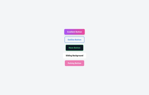 5 Different Style of Button
Gradient Button outline button neon button Sliding Background pulsing Button
7 months ago466 -
1 year ago2.4k
-
 Premium Gaming UI Card, Form & Animated Button (Tailwind CSS)
A modern, senior-level gaming UI built with Tailwind CSS focusing on spacing, typography, and calm visual hierarchy rather than noisy effects. This component set includes: A premium gaming card with clear content structure and outcome-focused copy A clean player signup form with accessible focus states and minimal visual noise A custom animated button using a restrained light-sweep effect for premium interaction feedback Designed to resemble real production gaming platforms rather than demo or template UI. Fully responsive, copy-paste ready, and easy to extend for real-world projects.
1 month ago144 -
 3 years ago10.2k
 -
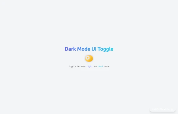 Animated Light/Dark Mode Toggle
👉🏻3D glow effects on knob & track 👉🏻Gradient transitions that look holographic 👉🏻Animated pulse when active 👉🏻Dark background gradient instead of a flat color 👉🏻Emoji swap (☀️ → 🌙)
4 months ago364 -
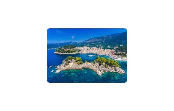 Image Card
An image. Shows title and description info when hovering. Image zooms and darkens when hovering.
9 months ago827 -
 3 years ago9.8k
 -
3 years ago14.5k
-
 2 years ago11.6k
 -
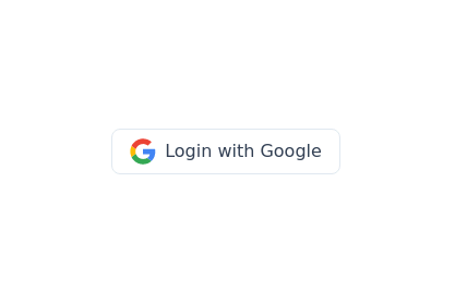 Google login/signup button
Styled button designed for users to log in or authenticate using their Google account. The button features a Google logo (represented by an SVG image) on the left and the text "Login with Google" on the right.
2 years ago40.4k -
Plug and Play Animated Button for Hero Statements / Landing Pages
REMOVE the bg-black from the outside <button/> div, if you are already using a black background. Besides this, the button is plug and play! Know errors: You may need to remove animate-spin for your usecase, depending on framework rendering. For SvelteKit, animate-spin is NOT needed. But the [animation:spin_4s]... is always necessary for a smooth effect. Check out my profile to join my community online or add me on LinkedIn.
1 year ago2k -
 Ripple Button
Ripple Button is an interactive button component with a ripple animation that responds to user clicks
2 years ago13.5k


Explore components by Tags
Didn't find component you were looking for?
Search from 3000+ components