Teste
This tailwind example is contributed by Barbara Santos, on 02-Dec-2024. Component is made with Tailwind CSS v3.

Author Barbara Santos
Related Examples
-
 3 years ago23k
 -
 3 years ago12.7k
 -
 Nutrition facts table
Show Nutrient contents with a stripped table
3 years ago13.5k -
 Adminpanel
Three tabs, switch between each other, change color when clicked. Tables with filter, search, with a drop-down form to fill.
11 months ago1.7k -
 3 years ago11.1k
 -
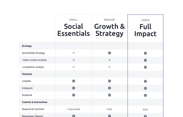 Pricing comparison table
Showcase different pricing tiers or plans for a product or service.
1 year ago2.5k -
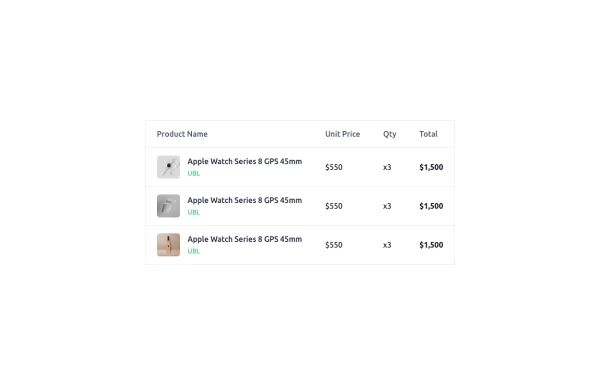 Modern Responsive Product Table Design with TailwindCSS
This is a clean and responsive product listing table built with HTML and TailwindCSS. The table displays product images, names, unit prices, quantities, and total costs in a structured format. It adapts to different screen sizes by enabling horizontal scrolling on smaller devices. The design is minimal yet functional, making it ideal for e-commerce websites, order summaries, and invoice pages. Let me know if you need any refinements!
1 year ago1.8k -
 3 years ago15.9k
 -
 3 years ago11.8k
 -
 light mode table
"pretty" table
5 months ago479 -
 3 years ago16.4k
 -
 Table
Tabletables
1 year ago5.3k


Explore components by Tags
Didn't find component you were looking for?
Search from 3000+ components