ztailwindsnippet01
This tailwind example is contributed by Anonymous, on 14-Jul-2026. Component is made with Tailwind v3.4. It is responsive.

Related Examples
-
 Made a sinup form
Made a sinnup form #sufyandev
449 -
 FLESH & BONE
Stranded in the heart of a cannibal-infested jungle, you must make unthinkable choices to survive. How far will you go to see another sunrise?
1.2k -
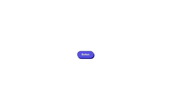 🔥 Sleek & Modern Button with Hover Effect – Tailwind CSS
A beautifully designed button using Tailwind CSS, featuring smooth transitions, a bold shadow effect, and a hover animation. Styled with custom colors, rounded edges, and a modern font, this button is perfect for call-to-action (CTA) elements in your website or app. 🚀
1.3k -
 Modern Architecture Blog & News Grid UI Layout
A clean, minimal, and fully responsive Blog/News grid layout built with Tailwind CSS. Features a 2-column article grid with fixed title alignment, clean pagination, and a sticky sidebar with categories & CTA widget. Perfect for architectural firms, magazine portals, and CMS integrations.
190 -
 Card KPI
Targetas
-
 trusted by
1. Color Scheme: 1. Updated the background to a gradient from Indigo-800 to Blue-900 2. Changed text colors to use Indigo-800 and Blue-900 shades 3. Updated ring colors on avatar images to match the new scheme 2. Enhanced Design: 1. Added a containing card with white background (dark gray in dark mode) 2. Increased the size of avatar images for better visibility 3. Added a shadow effect to the card that changes color on hover 3. Responsiveness: 1. Maintained the responsive layout, stacking vertically on smaller screens 4. Animations and Interactions: 1. Added a fade-in animation for the entire component 2. Enhanced hover effects on avatar images (scale and z-index change) 3. Added a ring effect on hover for each avatar 5. Accessibility: 1. Maintained alt text for images 2. Ensured proper color contrast for text readability 6. Dark Mode: 1. Implemented dark mode support 2. Adjusted colors and ring effects for dark mode 7. Additional Enhancements: 1. Increased font sizes for better readability 2. Added font weight variations to emphasize important text 3. Improved spacing and alignment This updated component maintains the original functionality while incorporating the Indigo-800 and Blue-900 color scheme and adding enhanced visual effects and interactions.
2.3k -
 3D Coverflow Slider — Ambient Background
A depth-based 3D slider with real perspective and rotateY transforms (not just fade), paired with a drifting polyhedra background that responds to cursor movement. Zero dependencies — pure Tailwind utilities, one config file, and vanilla JS. Auto-plays, pauses on hover, fully keyboard/dot-navigable. Swap the color tokens in the config to reskin it.
202 -

-
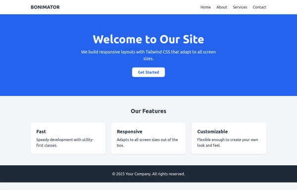 BONIMATOR Responsive Tailwind Starter Template
Responsive Tailwind Starter Template
1.3k -

-

-
 Lots of button examples
tailwind button examples
1.3k







Browse by topic
Explore components by Tags
Jump straight to the UI pattern you need.
Can't find it?
Didn't find the component you were looking for?
Search across 3,000+ community-built components and grab the code in seconds.