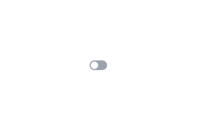
Neumorphic Toggle Switch
This tailwind example is contributed by Anonymous, on 14-Dec-2024. Component is made with Tailwind CSS v3. It is responsive.

Author Anonymous
Related Examples
-
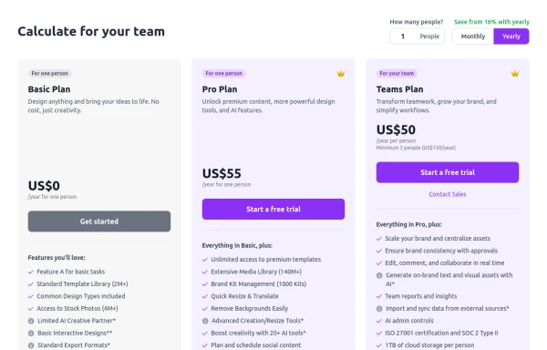 Configurable 3-Tier Responsive Pricing Table
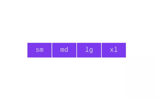
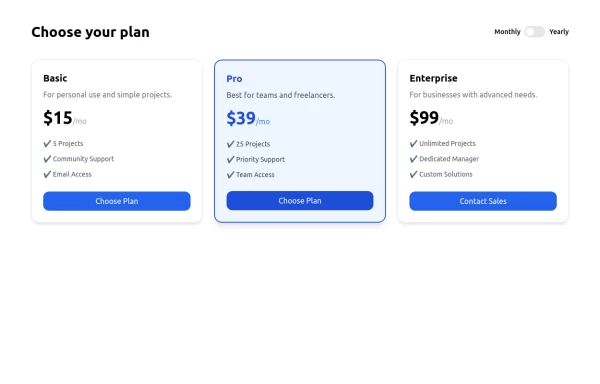
A modern, responsive pricing table component inspired by SaaS layouts, built with HTML and Tailwind CSS. Features three distinct pricing tiers displayed in cards, stacking vertically on smaller screens and transitioning to a 3-column grid on large screens (lg breakpoint). Includes interactive top controls for selecting the number of users and toggling between monthly/yearly billing cycles. Each card uses placeholder content for icons, titles, descriptions, features (with checkmarks/info icons), and distinct call-to-action buttons, making it easily adaptable. Styled with subtle background colors and clear typography for excellent readability.
10 months ago758 -
 Interactive Toggle Switch with Smooth Animation
A stylish toggle switch component built with Tailwind CSS and enhanced with minimal JavaScript. This toggle switch features smooth color transitions, dynamic text ("ON/OFF"), and a moving indicator ball, providing a visually appealing and functional design. Ideal for modern web interfaces where toggling functionality is required. Easily customizable for various use cases.
1 year ago1.8k -
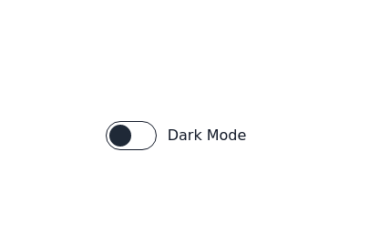
Dark mode toggle button
Switch to dark mode without any hassle with this simple JavaScript hack. Sun night button
2 years ago21.6k -
 Infinity Premium Dashboard Tailwind
Website Dashboard Admin with tailwind CSS CDN, responsif via mobile and tablet
2 weeks ago120 -
 3 years ago16k
 -
 Toggle Switch
Toggle switch for dark mode
3 years ago17.2k -
![Material 3 Switches [Light]](https://tailwindflex.com/storage/thumbnails/material-3-switches-light/canvas.min.webp?v=23) Material 3 Switches [Light]
Material 3 Switches [Light]Switches that conform to Google's Material 3 design guidelines
9 months ago763 -
 Button group
Add active class to clicked button using JavaScript
3 years ago10.6k -
 Checkbox models
Tailwind Checkbox models
9 months ago1.1k -
 Animated hero section template for a ecommerce store
A bold, animated hero section template that brings personality and energy to your ecommerce shoe store. Features floating 3D elements, vibrant gradients, and playful animations that make your products pop off the screen. Features: - Light & dark mode with smooth transitions and persistent theme preference - Fully responsive design optimized for mobile, tablet, and desktop - Eye-catching floating shoe display with rotating decorative elements - Animated gradient backgrounds and glowing CTAs - Modern color scheme with pink, purple, and yellow accents - Social proof stats section for building trust - Clean, semantic HTML with Tailwind CSS utility classes - Zero dependencies - just copy, customize, and deploy - Open source and free to use for commercial projects For: Sneaker stores, footwear brands, fashion ecommerce sites, streetwear shops, or any modern retail brand looking to make a memorable first impression with a hero section that doesn't take itself too seriously. Quick Setup: Simply replace the emoji placeholder with your product image, update the copy to match your brand voice, adjust the color gradients to your palette, and you're ready to launch!
1 month ago283 -
 Responsive Pricing Table with Toggle Switch — Built with Tailwind Flex
A clean, responsive Pricing Table UI built entirely with Tailwind CSS and Flexbox. Includes a smooth monthly/yearly toggle switch, fully mobile-friendly layout, and modern design — perfect for SaaS, startups, freelancers, or any web project. 📱 100% Responsive 🎯 Easily customizable 💡 Ideal for client or personal projects
10 months ago955 -
 2 years ago12.9k


Explore components by Tags
Didn't find component you were looking for?
Search from 3000+ components