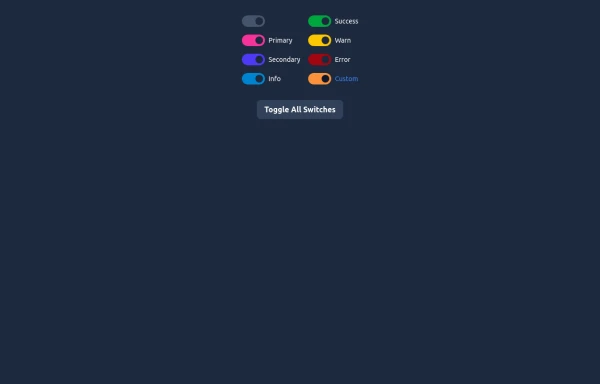
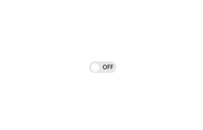
Material 3 Switches [Light]
Switches that conform to Google's Material 3 design guidelines
This tailwind example is contributed by Nick Girga, on 18-May-2025. Component is made with Tailwind CSS v3. It is responsive. It supports dark mode.

Author Nick Girga
Related Examples
-
1 year ago2k
-
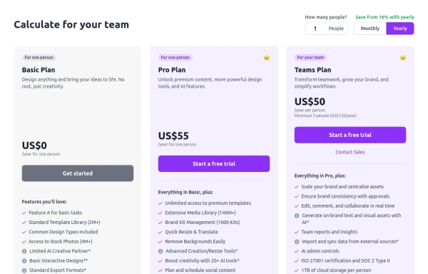 Configurable 3-Tier Responsive Pricing Table
A modern, responsive pricing table component inspired by SaaS layouts, built with HTML and Tailwind CSS. Features three distinct pricing tiers displayed in cards, stacking vertically on smaller screens and transitioning to a 3-column grid on large screens (lg breakpoint). Includes interactive top controls for selecting the number of users and toggling between monthly/yearly billing cycles. Each card uses placeholder content for icons, titles, descriptions, features (with checkmarks/info icons), and distinct call-to-action buttons, making it easily adaptable. Styled with subtle background colors and clear typography for excellent readability.
10 months ago872 -
 3 years ago16.1k
 -
 Checkbox models
Tailwind Checkbox models
10 months ago1.1k -
 2 years ago12.9k
 -
 Toggle switch
toggle switch with smooth animation
1 year ago3.9k -
 Elegant Switches
Useful Tailwind classes for creating several types of basic switches.
10 months ago795 -
 Interactive Toggle Switch with Smooth Animation
A stylish toggle switch component built with Tailwind CSS and enhanced with minimal JavaScript. This toggle switch features smooth color transitions, dynamic text ("ON/OFF"), and a moving indicator ball, providing a visually appealing and functional design. Ideal for modern web interfaces where toggling functionality is required. Easily customizable for various use cases.
1 year ago1.8k -
Dark mode toggle button
Switch to dark mode without any hassle with this simple JavaScript hack. Sun night button
2 years ago21.6k -
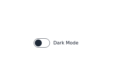 Toggle Switch
Toggle switch for dark mode
3 years ago17.3k -
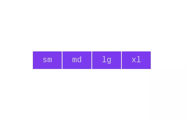 Button group
Add active class to clicked button using JavaScript
3 years ago10.8k -
 2 years ago16.7k


Explore components by Tags
Didn't find component you were looking for?
Search from 3000+ components