Checkbox models
Tailwind Checkbox models
This tailwind example is contributed by QQ-VVN, on 11-May-2025. Component is made with Tailwind CSS v3. It is responsive. It supports dark mode.

Author QQ-VVN
Related Examples
-
 Configurable 3-Tier Responsive Pricing Table
A modern, responsive pricing table component inspired by SaaS layouts, built with HTML and Tailwind CSS. Features three distinct pricing tiers displayed in cards, stacking vertically on smaller screens and transitioning to a 3-column grid on large screens (lg breakpoint). Includes interactive top controls for selecting the number of users and toggling between monthly/yearly billing cycles. Each card uses placeholder content for icons, titles, descriptions, features (with checkmarks/info icons), and distinct call-to-action buttons, making it easily adaptable. Styled with subtle background colors and clear typography for excellent readability.
10 months ago758 -
 Infinity Premium Dashboard Tailwind
Website Dashboard Admin with tailwind CSS CDN, responsif via mobile and tablet
2 weeks ago120 -
 Horizon Premium Dashboard Tailwind
Website Dashboard Admin with tailwind CSS CDN
2 weeks ago99 -
 3 years ago11.7k
 -
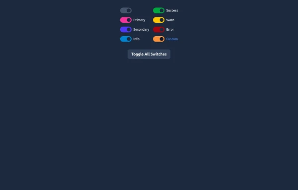 Elegant Switches
Useful Tailwind classes for creating several types of basic switches.
9 months ago715 -
 NOTIFICATION
This code can serve as a boiler-plate for a notification for an application
2 weeks ago20 -
 about video
about kelaplus video
7 months ago827 -
 4 months ago540
 -
 Password Generator
This is a simple and responsive Password Generator built with HTML, Vanilla JavaScript, and Tailwind CSS. It allows users to create secure passwords by selecting custom options such as length, uppercase letters, lowercase letters, numbers, and symbols. Ideal for developers or users looking for a fast and customizable password tool.
7 months ago532 -
 3 years ago12.5k
 -
 Feeds
FeedsThis is a responsive social media feed interface built with Tailwind CSS that features a clean, modern design with excellent color contrast and visual hierarchy. Here's a detailed breakdown of its components and layout:
9 months ago874 -
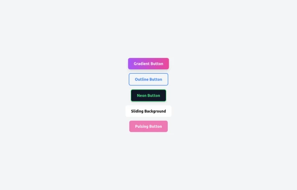 5 Different Style of Button
Gradient Button outline button neon button Sliding Background pulsing Button
7 months ago466


Explore components by Tags
Didn't find component you were looking for?
Search from 3000+ components