Image carousel
Uses Flowbite
This tailwind example is contributed by Anonymous, on 26-Nov-2024. Component is made with Tailwind CSS v3. It is responsive. It supports dark mode.

Author Anonymous
Related Examples
-
 Hero Section
Responsive Hero Section for you Project Background Image: A stunning, high-quality Unsplash photo that creates a unique visual impact. Overlay: Semi-transparent black overlay with blur effect for readability and a modern aesthetic. Content Area: Centered with a gradient background overlay for contrast, bold headline, engaging subtext. Buttons: Vibrant gradient and clean border with smooth hover animations to draw attention. Responsive Design: Looks great on all screen sizes with adaptable padding and font sizes.
8 months ago1.5k -
 Premium High-Performance Web Gaming Hub
Experience the future of browser-based gaming. I’ve developed a premium arcade hub designed for speed, clarity, and zero-latency gameplay. Built with modern web technologies, Ayyamperumal Games brings AAA-inspired visuals and high-octane mechanics directly to your browser—no downloads, no lag, just pure performance. Explore a curated library of titles ranging from minimalist logic puzzles like Sudoku Elite to fast-paced action in Neon Drift. This is where clean code meets high-level entertainment.
2 months ago393 -
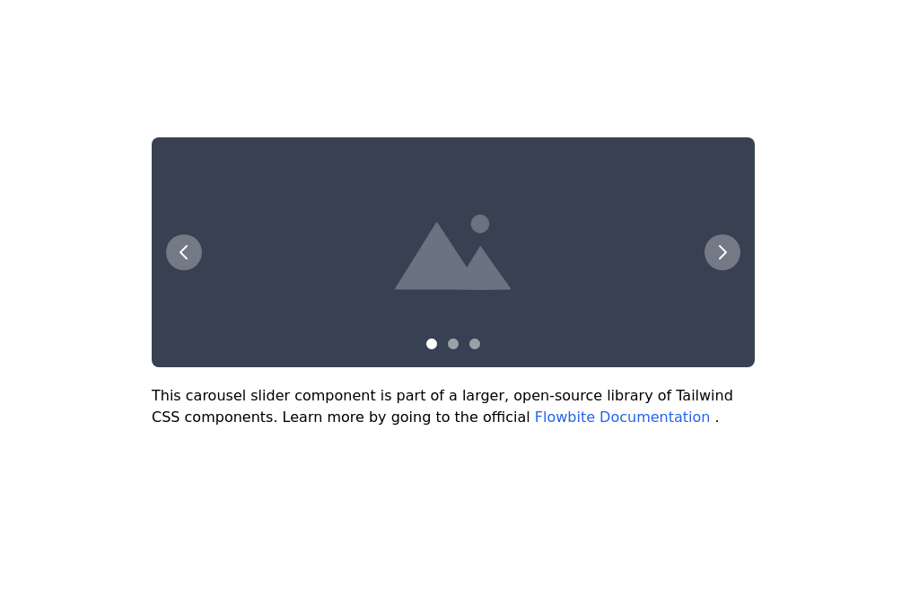 Image carousel
Uses Flowbite
3 years ago31.5k -
 1 year ago3.1k
 -
 Linear dinamique section by Raul antonio de la cruz hernandez remix omerlinx responsive
Linear dinamique section by Raul antonio de la cruz hernandez remix omerlinx responsive
2 months ago201 -
 2 years ago7.2k
 -
 Slider
Responsive slider
1 year ago2.5k -
 responsive slider carousel
slider carousel
1 year ago2.3k -
 Galerie Interactive
Galerie Interactive
1 month ago66 -
 1 year ago6.9k
 -
 pile carde scroll
pile carde scroll
1 month ago134 -
 ArtoGallery
Explore a curated selection of contemporary and classic artwork, connecting collectors and creators in an inspiring online space.
9 months ago1.3k


Explore components by Tags
Didn't find component you were looking for?
Search from 3000+ components