htmlcolours
This tailwind example is contributed by Anonymous, on 22-Jun-2025. Component is made with Tailwind CSS v3. It is responsive.

Author Anonymous
Related Examples
-
 basichtml
this is basic html
8 months ago484 -
 basichtml
this is basic html
8 months ago466 -
 hero modern
hero modern
2 months ago129 -
 Premium High-Performance Web Gaming Hub
Experience the future of browser-based gaming. I’ve developed a premium arcade hub designed for speed, clarity, and zero-latency gameplay. Built with modern web technologies, Ayyamperumal Games brings AAA-inspired visuals and high-octane mechanics directly to your browser—no downloads, no lag, just pure performance. Explore a curated library of titles ranging from minimalist logic puzzles like Sudoku Elite to fast-paced action in Neon Drift. This is where clean code meets high-level entertainment.
2 months ago284 -
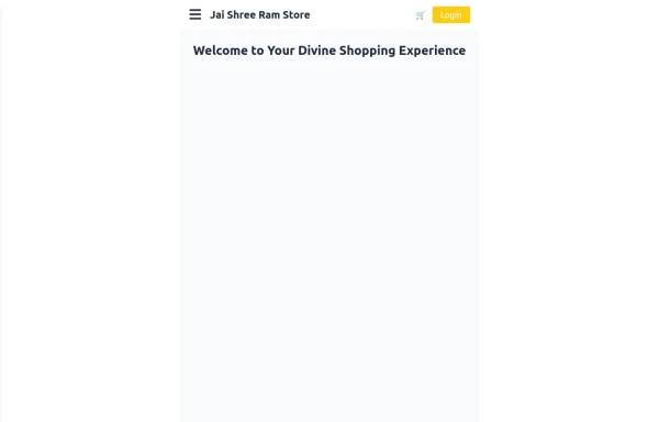 Responsive eCommerce Sidebar Layout with Hamburger Menu | Tailwind CSS UI for Online Stores
Build a clean and responsive eCommerce sidebar layout with a smooth hamburger menu using Tailwind CSS and Alpine.js. Ideal for devotional, spiritual, or modern online stores. Includes dark mode support, navigation links, cart, login, and a dynamic layout for beautiful product pages.
9 months ago1.1k -
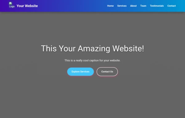
Responsive Navbar Example
A working example of the navbar
3 years ago17.2k -
Glowing gradient border
on hover glow border
3 years ago24.9k -
 3 years ago14.9k
 -
 Production-Ready Responsive Navigation
This is a sample content area. Scroll down to see the fixed header in action.
1 year ago3.6k -
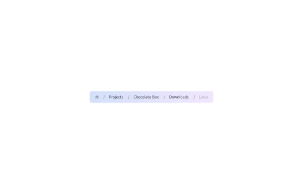 Gradient Breadcrumb
Breadcrumb. Gradient background. Gradient text on hover. Based on gopi/breadcrumb-2.
10 months ago933 -
 Colourful NavBar by Itunu Ijila
Responsive Colorful Navbar with Tailwind CSS - Free HTML Template Modern, mobile-friendly navigation bar built with Tailwind CSS featuring vibrant gradient colors (purple, pink, red). Includes hamburger menu for mobile devices, smooth hover effects, and easy customization. Perfect for websites, landing pages, and web applications. Copy-paste ready HTML code with Tailwind CDN - no build process required. Fully responsive design that works on all screen sizes. Keywords: Tailwind CSS navbar, responsive navigation bar, colorful navbar template, HTML navbar component, mobile menu, gradient navbar, Tailwind navigation, free navbar template
1 month ago37 -
 Modern Responsive Footer with Tailwind CSS
This sleek and modern responsive footer is built using HTML and Tailwind CSS. It features three sections: brand information, useful links, and social media icons. The footer includes smooth hover effects, subtle fade-in animations, and a fully responsive design that adapts seamlessly to different screen sizes. Perfect for websites looking for a professional and stylish footer section.
1 year ago2.1k


Explore components by Tags
Didn't find component you were looking for?
Search from 3000+ components