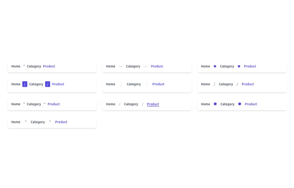
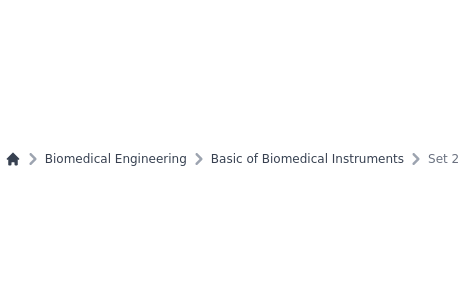
Gradient Breadcrumb
Breadcrumb. Gradient background. Gradient text on hover. Based on gopi/breadcrumb-2.
This tailwind example is contributed by Nick Girga, on 28-Apr-2025. Component is made with Tailwind CSS v3. It is responsive.

Author Nick Girga
Related Examples
-
 Clean AI Chat UI with Tailwind CSS – ChatGPT-Style Interface
A polished and responsive AI chat interface built using modern Web Components and Tailwind CSS. This UI replicates the smooth, minimal experience of ChatGPT with a clean layout, floating input bar, animated scrollable message feed, and mock AI responses. Ideal for SaaS dashboards, AI assistants, or frontend prototypes. Designed with professional spacing, accessible colors, and reusable components. Key features: Responsive layout with mobile support Floating input bar with auto-expanding textarea Tailwind-powered message bubbles with clear sender roles Modern dark theme with subtle gradients and shadows Easily extendable to real AI APIs (e.g., OpenAI)
8 months ago1.8k -
 Acode master
Acode master(=>good work for Acode master)
8 months ago847 -
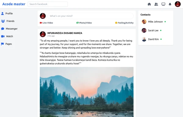 SocialSphere: A Full-Stack Social Media Platform
SocialSphere is a full-stack social media platform inspired by Facebook, built using HTML CSS
8 months ago842 -
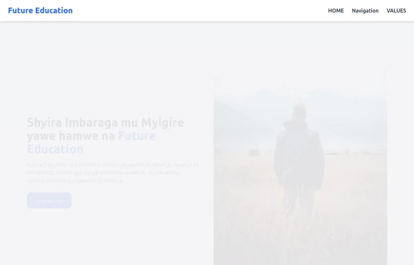
 Hero Section
Responsive Hero Section for you Project Background Image: A stunning, high-quality Unsplash photo that creates a unique visual impact. Overlay: Semi-transparent black overlay with blur effect for readability and a modern aesthetic. Content Area: Centered with a gradient background overlay for contrast, bold headline, engaging subtext. Buttons: Vibrant gradient and clean border with smooth hover animations to draw attention. Responsive Design: Looks great on all screen sizes with adaptable padding and font sizes.
7 months ago1.4k -
 3 years ago12.1k
 -
 2 years ago11.5k
 -
 3 years ago10.6k
 -
 color blur
blur
11 months ago1.7k -
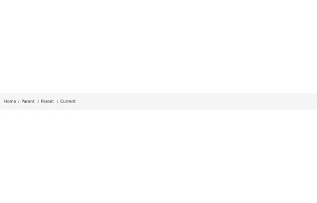
 Breadcrum
Different styles of breadcrum component
11 months ago1.2k -
 Personal Portfolio Website
Nziza HAMZY 😎! Reka dukore full TailwindCSS Portfolio yuzuye na: Hero Section About Section Projects Section (cards) Contact Form Animations & hover effects Fully responsive for mobile
5 months ago560 -
 3 years ago8.5k
 -
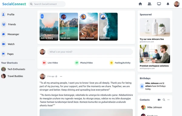 SocialConnect - Stay Connected
SocialConnect - Stay Connected
8 months ago730


Explore components by Tags
Didn't find component you were looking for?
Search from 3000+ components