Cards with animated corners
This tailwind example is contributed by Anonymous, on 29-Oct-2026. Component is made with Tailwind v3.4. It is responsive.

Related Examples
-
 Hero Section
Modern Gradient Color Scheme - Uses a professional purple-to-teal gradient for visual appeal Animated Elements: Floating decorative circles with subtle animation Fade-in effect for the main illustration Pulsing status indicator Engaging Typography: Gradient text for key phrases Responsive font sizing Clean Poppins font family Social Proof Elements: Client avatars Star ratings Trust indicators ("Trusted by 500+ businesses") Call-to-Action Buttons: Primary gradient button Secondary outlined button Hover effects and transitions Visual Hierarchy: Clear headline with emphasis on transformation Supporting subheading Balanced layout with image Performance Indicators: ROI badge Growth metric badge Responsive Design: Works on mobile and desktop Grid layout that adapts to screen size
1.4k -
 Track Your Order
-
 Customer support chatbox
Floating chatbox
12.2k -
 1.2k
-

-
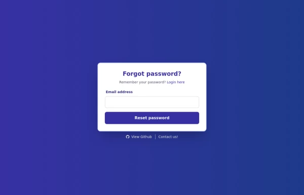 Forgot Password Form
1. Color Updates: 1. Changed background to gradient `from-indigo-800 to-blue-900` 2. Updated text colors to match the new theme 3. Changed button colors to `bg-indigo-800` with `hover:bg-blue-900` 4. Updated focus rings to use indigo colors 5. Made footer links white with indigo hover states 2. Enhanced Styling: 1. Added gradient background 2. Improved border radius to `rounded-xl` 3. Enhanced shadow with `shadow-2xl` 4. Added hover scale effects 5. Added fade-in animation 3. Dark Mode Improvements: 1. Enhanced dark mode colors 2. Added system preference detection 3. Improved dark mode contrast 4. Updated dark mode focus rings 4. Added Functionality: 1. Added form validation 2. Added success message 3. Added form reset after submission 4. Added smooth transitions 5. Accessibility Improvements: 1. Maintained ARIA attributes 2. Enhanced focus states 3. Improved color contrast 4. Added transition animations for better UX 6. Added Interactions: 1. Hover effects on all interactive elements 2. Scale animation on card and button hover 3. Smooth color transitions 4. Form validation feedback The form now matches the Indigo-800 and Blue-900 color scheme while maintaining dark mode support and adding enhanced animations and interactions.
2.4k -
 Native HTML Accordion
native html accordion summary details
3k -
 2.2k
-
 Responsive Multi-Step Registration
-
 Productivity Dashboard UI
A modern developer productivity dashboard built using HTML, Tailwind CSS, JavaScript, and Chart.js. Features a premium SaaS-style UI with analytics cards, interactive charts, kanban sprint board, developer management table, live search functionality, responsive layouts, activity feeds, and modern frontend components. Designed for frontend developers to showcase dashboard architecture, UI/UX skills, responsive design systems, and interactive web application interfaces. Includes glassmorphism styling, developer workflow management, team collaboration sections, and portfolio-ready dashboard components optimized for modern admin experiences.
599 -
 Simple Login & Register Page
Login and Register Page using Tailwind, Alpine JS, and Fontawesome
4.2k -
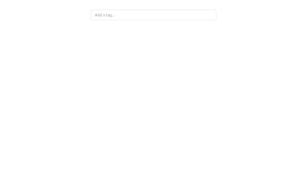 Tag Input field
This code creates a dynamic tag input field using HTML, JavaScript, and TailwindCSS. Users can type tags into the input field and press "Enter" to add them. Each tag is displayed inside the input field as a styled container with a remove button. The tag input is limited to a maximum of 5 tags, and an error message is shown if the limit is exceeded. Users can remove tags to free up space for new ones. The input field and tags are styled using TailwindCSS, ensuring a clean and responsive design.
2.7k




Browse by topic
Explore components by Tags
Jump straight to the UI pattern you need.
Can't find it?
Didn't find the component you were looking for?
Search across 3,000+ community-built components and grab the code in seconds.