Analytics dashboard with multiple chart types
Analytics Dashboard
Comprehensive data insights and performance metrics
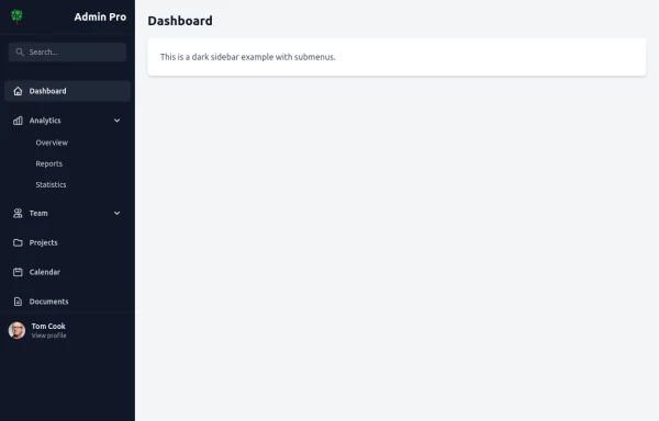
This tailwind example is contributed by Alif Bima Pradana, on 13-Feb-2026. Component is made with Tailwind CSS v3. It is responsive. similar terms for this example are Admin Dashboard, User dashboard

Author Alif Bima Pradana
Related Examples
-
 SPMB Dashboard - New Student Admission System
modern, luxurious, and elegant admin website dashboard
20 hours ago10 -
 Tailwind Dashboard
full responsive
11 months ago1.8k -
 background
A background is the area behind the content of an element (like a page, section, or div). It helps define the look and feel by adding colors, images, gradients, or patterns.
9 months ago1.1k -
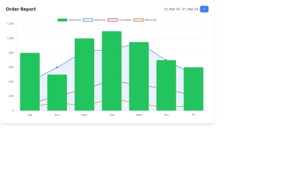 Interactive Order Report Chart with TailwindCSS and Chart.js
Create a stunning and interactive order report chart using HTML, TailwindCSS, and Chart.js. This chart combines bar and line graphs to visualize delivered, shipping, cancelled, and returned orders effectively. Perfect for dashboards and analytics pages with responsive design and clean aesthetics.
1 year ago1.6k -
 pange
pangepejdz
2 years ago11.9k -
 4 months ago554
 -
 High-Performance Hotel Operations & AI Agent Testing Dashboard
A sophisticated, real-time command center designed for modern hotel management. This dashboard features deep integration for monitoring AI agent performance, guest sentiment, and room occupancy. Built with a "Mobile-First" philosophy, it demonstrates advanced data visualization, glassmorphism UI design, and a centralized state-management architecture. Perfect for showcasing full-stack capabilities in AI-driven automation.
2 weeks ago243 -
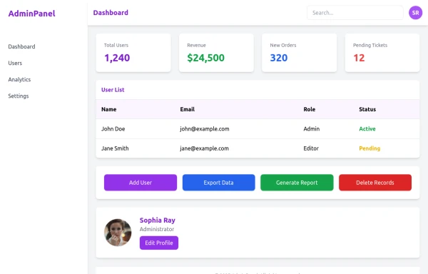
 Adminpanel
Three tabs, switch between each other, change color when clicked. Tables with filter, search, with a drop-down form to fill.
1 year ago1.7k -
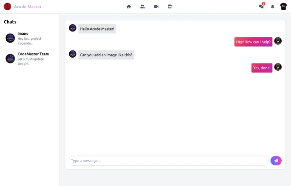 Acode Master - FB & WhatsApp UI Combo
Description (meta description) ni tag ikoreshwa mu mutwe (head) wa HTML igaragaza mu ncamake icyo urubuga cyangwa urupapuro rwawe ruvuga. Iyi description ikoreshwa cyane na search engines (nka Google) mu kwerekana summary y’urubuga mu bisubizo by’ubushakashatsi.
9 months ago621 -
 admin panel UI
Premium Admin Panel Pack including sidebar navigation, top navbar, dashboard cards, user tables, quick actions, profile section, and footer. Fully responsive with modern clean design using Tailwind CSS.
8 months ago1.9k -
 canvas fully covers
canvas fully covers
10 months ago935 -
 1 year ago5.5k


Explore components by Tags
Didn't find component you were looking for?
Search from 3000+ components