Sign in with boogle button
This tailwind example is contributed by Conan Hilton, on 20-Sep-2022. Component is made with Tailwind CSS v3. It is responsive.

Author Conan Hilton
Related Examples
-
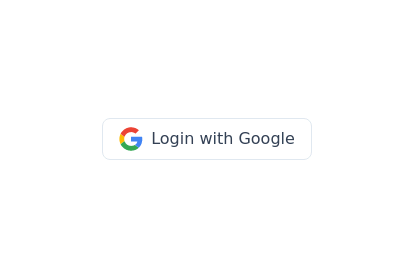 Google login/signup button
Styled button designed for users to log in or authenticate using their Google account. The button features a Google logo (represented by an SVG image) on the left and the text "Login with Google" on the right.
2 years ago40.7k -
 3 years ago42k
 -
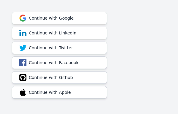 Continue with social login buttons (google, linkedin, twitter, facebook, github, apple)
Login/signup buttons for Google, LinkedIn, Twitter, Facebook, GitHub, and Apple
2 years ago17.7k -
 3 years ago11.4k
 -
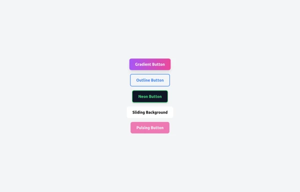 5 Different Style of Button
Gradient Button outline button neon button Sliding Background pulsing Button
8 months ago537 -
 Social buttons
Mono-color Social buttons change colors according to your need
3 years ago12.2k -
 Ripple Button
Ripple Button is an interactive button component with a ripple animation that responds to user clicks
2 years ago13.6k -
2 years ago37.9k
-
 Amazon shopping buy now button
Amazon shopping buy now button
1 year ago2.4k -
Canlı Yayın Butonu
Pulse efekt içeren canlı yayın butonu.
1 year ago1.9k -
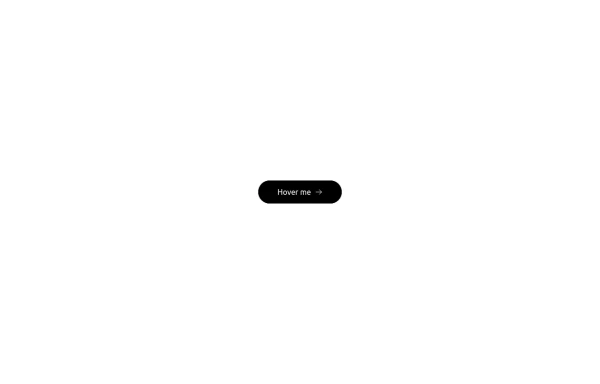 Button with hover effect
Button with light hover effect, responsive and suitable for light/dark mode.
6 months ago436 -
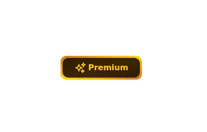 Gold Premium Button
🪙 Glowing Premium BIP Gold Button in pue Tailwind CSS
2 years ago5.7k


Explore components by Tags
Didn't find component you were looking for?
Search from 3000+ components