Forgot Password
Forgot Password
This tailwind example is contributed by Tanvir Hasan Bappy (Tanvir), on 28-Dec-2025. Component is made with Tailwind CSS v3. It is responsive.

Author Tanvir Hasan Bappy (Tanvir)
Related Examples
-
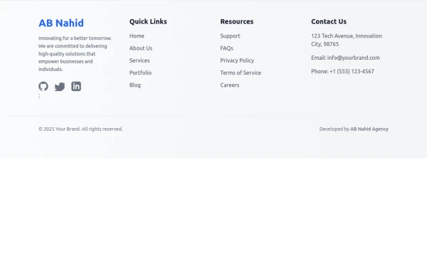 Responsive Light Mode Footer Component
This is a fully responsive and reusable light-mode footer component designed by ABNahid Agency. Built with a clean structure and optimized for modern web applications, this footer features essential sections, including About, Services, Contact, and Social Links. Ideal for personal portfolios, business websites, or startup platforms—plug and play in your React or HTML project.
7 months ago587 -
 why chose us
Designed with clarity and purpose, each section of our website is crafted to guide users effortlessly from engaging visuals to structured content that highlights our values and builds trust at every scroll. abnahid.com
4 months ago390 -
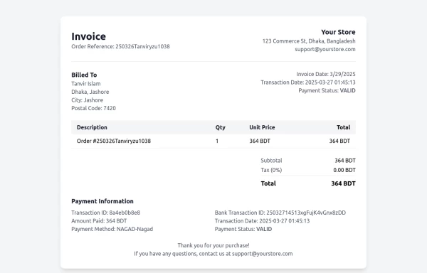 Invoice
Invoice
11 months ago822 -
 FLESH & BONE
Stranded in the heart of a cannibal-infested jungle, you must make unthinkable choices to survive. How far will you go to see another sunrise?
3 months ago288 -
 3 months ago194
 -
 joker
jokerjoker cyber punk
8 months ago1.2k -
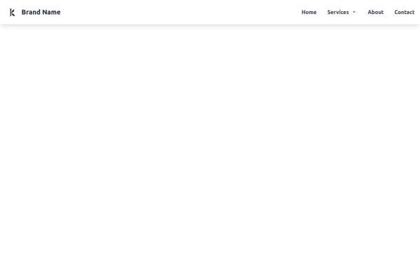 Tailwind CSS Navbar
Logo on the left. Main menu with a mega menu under "Services". Responsive design with a hamburger menu for mobile devices. Mega menu appears on hover for desktop and toggles on click for mobile.
8 months ago1.2k -
 Responsive navbar with alpinejs
A mix of Penguin navbar with PineUI Slide-Over
1 year ago3.3k -
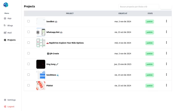 Table Content
Dashboard Table Content, with Sidebar Reusable for any window
1 year ago2.3k -
 Modern Responsive Footer with Tailwind CSS
This sleek and modern responsive footer is built using HTML and Tailwind CSS. It features three sections: brand information, useful links, and social media icons. The footer includes smooth hover effects, subtle fade-in animations, and a fully responsive design that adapts seamlessly to different screen sizes. Perfect for websites looking for a professional and stylish footer section.
1 year ago2.1k -
 Swiss-Grid Dark Pricing
A brutally minimalist pricing section that relies on strict grid architecture and typographic hierarchy instead of decorative elements. Features responsive border collapsing, monospaced technical accents, and high-performance CSS-only hover states. Designed for high-end SaaS, dev-tools, or agency portfolios that prioritize data clarity and structural rhythm.
2 months ago88 -
 Date picker
Date picker example using flatpickr library
2 years ago17.2k


Explore components by Tags
Didn't find component you were looking for?
Search from 3000+ components