Table
tables
This tailwind example is contributed by Aman kumar, on 28-Jun-2024. Component is made with Tailwind v3.4. It is responsive.

Related Examples
-
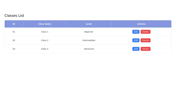 Responsive Classes List Table with Edit and Delete buttons using Tailwind CSS
This responsive classes list table is built using Tailwind CSS and features: - A clean layout with a header displaying column titles. - Action buttons for editing and deleting entries. - Responsive design that adapts to various screen sizes. - Easy customization options to fit your project's needs.
4.1k -

-
 Table
tables
6k -
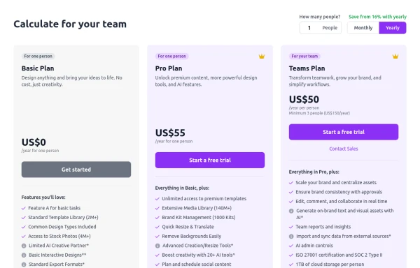 Configurable 3-Tier Responsive Pricing Table
A modern, responsive pricing table component inspired by SaaS layouts, built with HTML and Tailwind CSS. Features three distinct pricing tiers displayed in cards, stacking vertically on smaller screens and transitioning to a 3-column grid on large screens (lg breakpoint). Includes interactive top controls for selecting the number of users and toggling between monthly/yearly billing cycles. Each card uses placeholder content for icons, titles, descriptions, features (with checkmarks/info icons), and distinct call-to-action buttons, making it easily adaptable. Styled with subtle background colors and clear typography for excellent readability.
1.7k -
 CRUD
design table #####by html,css,js
1.8k -
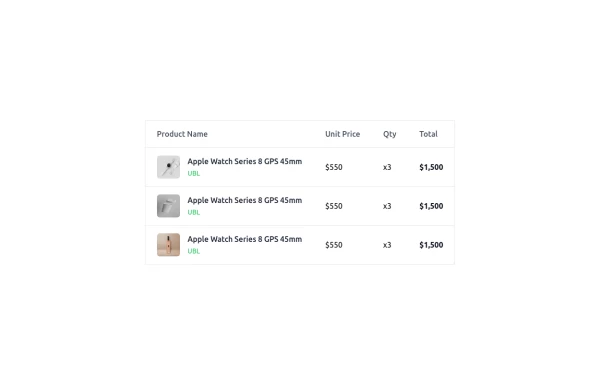 Modern Responsive Product Table Design with TailwindCSS
This is a clean and responsive product listing table built with HTML and TailwindCSS. The table displays product images, names, unit prices, quantities, and total costs in a structured format. It adapts to different screen sizes by enabling horizontal scrolling on smaller devices. The design is minimal yet functional, making it ideal for e-commerce websites, order summaries, and invoice pages. Let me know if you need any refinements!
2.4k -
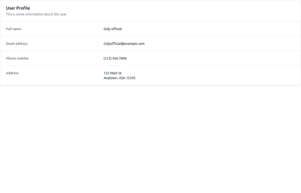 User Profile
This is some information about the user.
1.3k -
 11.4k
-

-
 Table CRUD
CRUD TABLE DESIGN
5.1k -
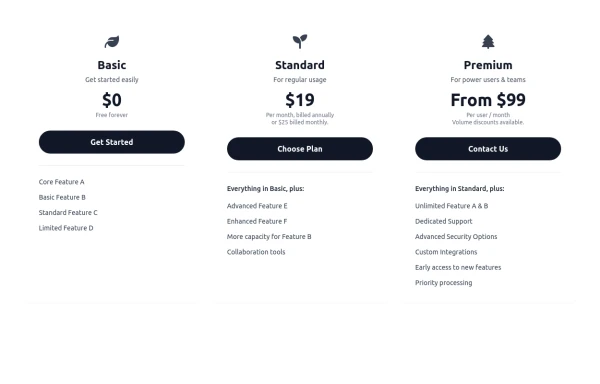 Responsive 3-Tier Pricing Card Section
A clean and responsive pricing table component featuring three distinct tiers (e.g., Basic, Standard, Premium) presented in a card layout. Built with HTML and Tailwind CSS, it stacks vertically on small screens and transitions to a side-by-side view on medium screens (md breakpoint - 768px) and up. Each plan card includes a placeholder icon, title, description, price details, a call-to-action button, and a bulleted list of features with checkmarks. The generic content makes it easy to adapt for various websites or applications needing a clear pricing comparison structure.
986 -








Browse by topic
Explore components by Tags
Jump straight to the UI pattern you need.
Can't find it?
Didn't find the component you were looking for?
Search across 3,000+ community-built components and grab the code in seconds.