37+ Free Notification examples in Tailwind CSS
A notification component is a user interface element that is used to inform the user of something, such as an error, warning, or confirmation message. These components are typically small and unobtrusive and are designed to appear and disappear quickly so as not to disrupt the user's workflow.
Notification components can be used to provide feedback to the user about the status of an action, such as the success or failure of a form submission, or to alert them to something that requires their attention, such as an incoming message or a reminder. Notification components are often used in conjunction with other UI elements, such as forms and buttons, to provide users with a clear and concise way to receive information and interact with the interface.
Similar terms: Toast, Snackbar
-
 2 years ago14.7k
 -
-
 2 years ago17.1k
 -
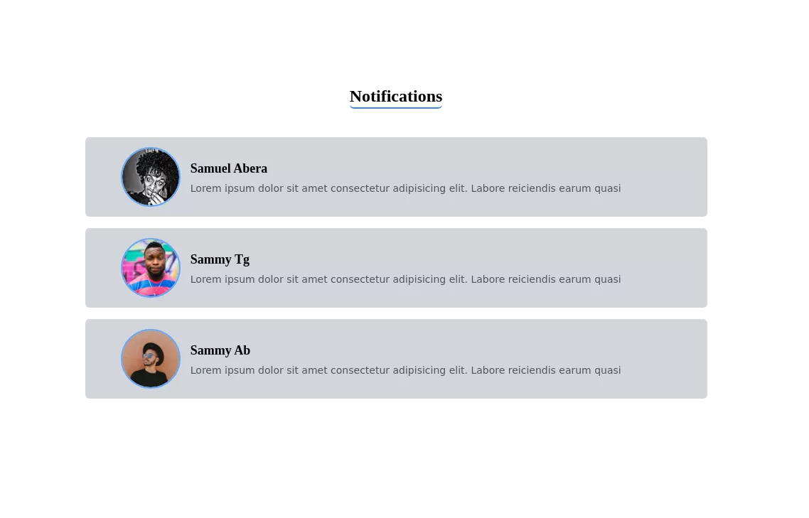 Notifications
Notifications
1 year ago3.8k -
 Toast
ToastFully Responsive Toast
1 year ago2.3k -
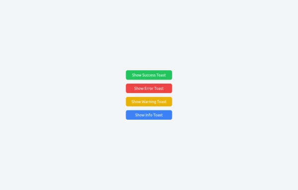
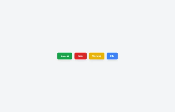
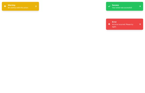 Succes Warning Error Toast Designs.
Succes Warning Error Toast Designs.
1 year ago2.1k -
 Notification
Dev Community Notification Clone
1 year ago3.1k -
 1 year ago994
 -
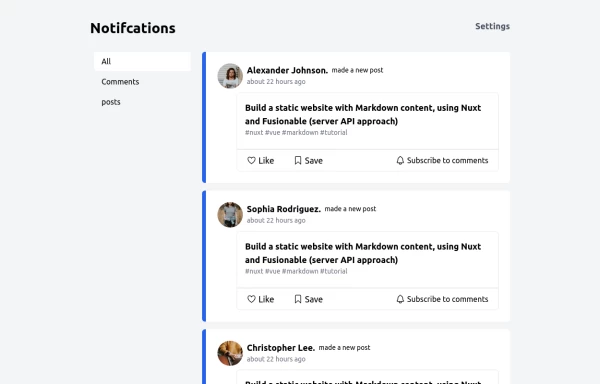
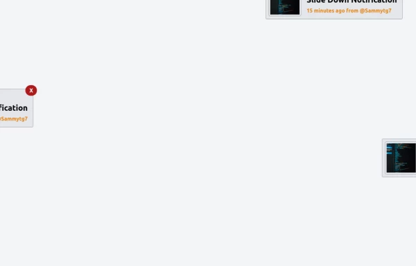
 Notifications
Toast Notifications are lightweight and customizable components for displaying short messages or alerts. They are perfect for feedback on user actions, such as form submissions or system updates. Supports different types of notifications (success, error, warning, info). Automatically hides after a specified timeout. Option to include action buttons or close icons. Customizable styles, animation, and position on the screen.
1 year ago1.2k -
 1 year ago1.8k
 -
 1 year ago823
 -
 Game Live Score
A live score game layout design perfect for your live scoring application
1 year ago1k -
 11 months ago949
 -
 Toast Notifications
Visually appealing toast notification component designed with Tailwind CSS
11 months ago1.2k -
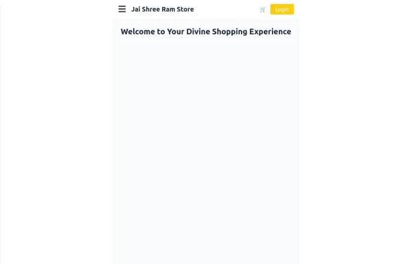 Responsive eCommerce Sidebar Layout with Hamburger Menu | Tailwind CSS UI for Online Stores
Build a clean and responsive eCommerce sidebar layout with a smooth hamburger menu using Tailwind CSS and Alpine.js. Ideal for devotional, spiritual, or modern online stores. Includes dark mode support, navigation links, cart, login, and a dynamic layout for beautiful product pages.
9 months ago1k


Didn't find component you were looking for?
Search from 3000+ components