500+ Free Card examples in Tailwind CSS
A card component is a flexible and extensible content container. Card has wide range of uses.
-
-
 Blog Card
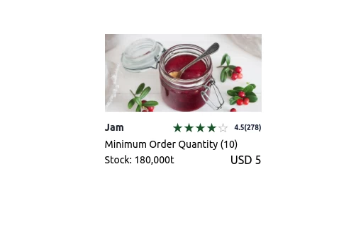
A blog card with dark-mode
2.7k -
-

-
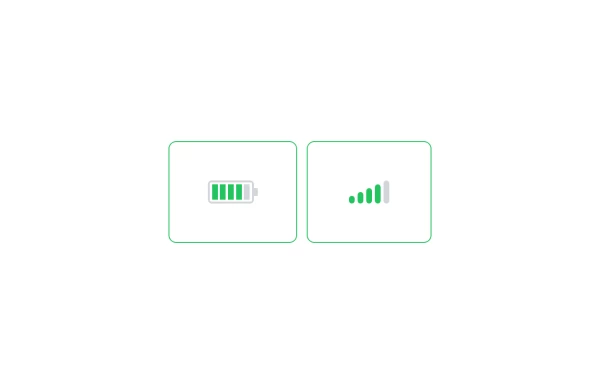 Battery and signal
 bar component
1.4k -

-
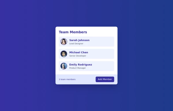 Cards - Users Card
This Users Card design includes: 1. Responsive layout using Flexbox 2. Indigo-800 and Blue-900 color scheme 3. Dark mode support 4. User list with avatars, names, and roles 5. Hover effects on user items 6. "Add Member" button 7. Card footer with team member count 8. Subtle animations and transitions 9. Accessibility considerations (proper heading structure, color contrast) Key features: - The background uses a gradient from Indigo-800 to Blue-900 - The card has a white background in light mode and dark gray in dark mode - Text colors are adjusted for readability in both light and dark modes - User avatars have a border color that changes in dark mode - User items have a hover effect that scales them slightly - The "Add Member" button uses Indigo-800 with a Blue-900 hover state - Dark mode is automatically applied based on system preferences - The entire card fades in on load for a smooth entrance - The card has a hover effect that enhances its shadow This design provides a clean, professional look for displaying team members while incorporating the requested color scheme and maintaining good usability across different devices and color modes.
2.7k -
 Responsive Tailwind CSS Listing Cards
This is a collection of responsive listing cards built with Tailwind CSS, optimized for modern web applications. The component features a flexbox layout, ensuring seamless responsiveness across mobile, tablet, and laptop screens. Each card includes an image, title, and description, styled for both light and dark modes. Perfect for showcasing products, portfolio items, or blog posts.
2.8k -
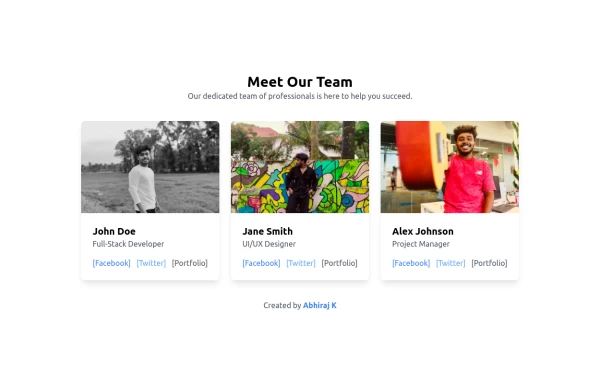 Team Members Showcase with Portfolio Backlink
Showcase your team's talent with this beautifully designed and responsive team members grid. Each card includes the member's photo, name, role, and social links. A special portfolio backlink is included to highlight your personal contributions as a developer. Supports light and dark modes.
2.5k -
 2.3k
-
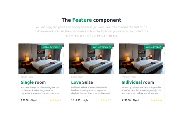 Hotel rooms
A simple room overview
2.1k -
 Personal card
A card to show minimal info for staff member
1.8k -
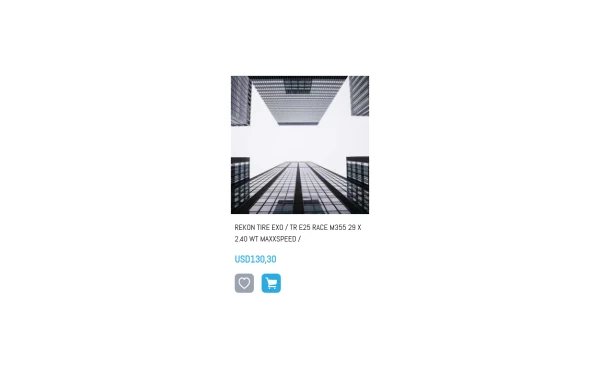 A product card with size selector
Using alpine it shows a size selector when clicking in cart
2k -
 2k
-






Can't find it?
Didn't find the component you were looking for?
Search across 3,000+ community-built components and grab the code in seconds.