Card
This tailwind example is contributed by $@(\/)(\/)¥, on 06-Jan-2025. Component is made with Tailwind CSS v3. It is responsive. It supports dark mode.

Author $@(\/)(\/)¥
Related Examples
-
 Login Form
A modern Tailwind CSS animated login form featuring smooth transitions, premium UI styling, responsive layout, and interactive input effects. Designed for admin panels, SaaS dashboards, and secure web applications, this login template delivers a clean light-theme interface with professional animations and a high-end user experience.
1 month ago91 -
 1 year ago2.4k
 -
 1 year ago1.3k
 -
 1 year ago1.9k
 -
 3 years ago15.2k
 -
 Ripple Animation
Component is made with Tailwind CSS v3. It is responsive. It supports dark mode. similar terms for this example are loading, loader,Author box, User information,Transitions
2 months ago351 -
 Card profile
profile card
2 years ago2.9k -
 Responsive Tailind css card
the best Responsive Card with image
9 months ago653 -
 1 year ago1.3k
 -
 carde Iptplus
Iptplus carde
3 months ago260 -
 1 year ago2.8k
 -
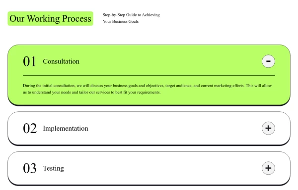 Responsive Working Process Section
This modern and responsive "Our Working Process" section adapts seamlessly to all screen sizes, ensuring a smooth user experience. The design follows a structured step-by-step layout with clear typography, bold colors, and interactive elements, making it perfect for showcasing business processes or workflows.
11 months ago1k


Explore components by Tags
Didn't find component you were looking for?
Search from 3000+ components