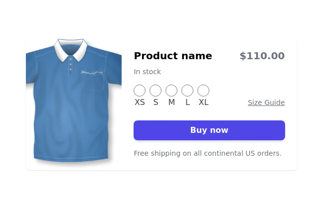
A product card with size selector
Using alpine it shows a size selector when clicking in cart
This tailwind example is contributed by farid, on 03-Jan-2025. Component is made with Tailwind v3.4. It is responsive. It supports dark mode. similar terms for this example are Product Showcase, Product card

Related Examples
-
-
 32.4k
32.4k -
 10.7k
10.7k -
 14.5k
14.5k -
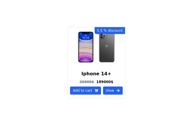 Card Component
A Simple Card Component with full responsiveness and dark mode supported
-
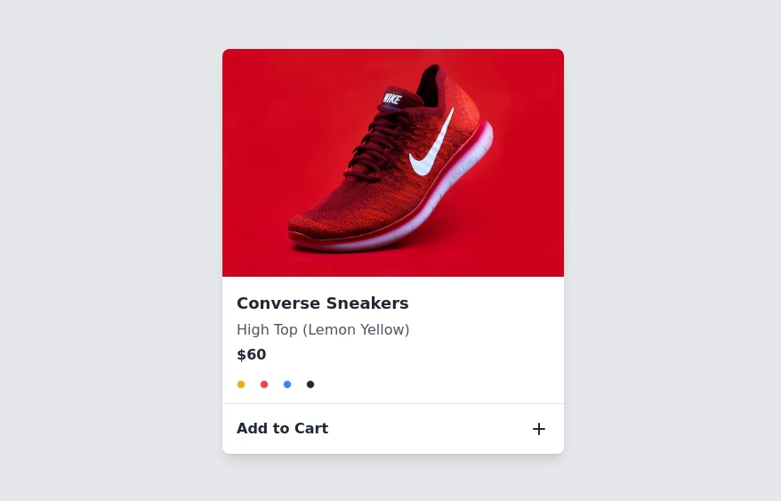 Product card
sleek and modern product card
7.4k -
 Minimal Card
This is awesome looking card
3.4k -
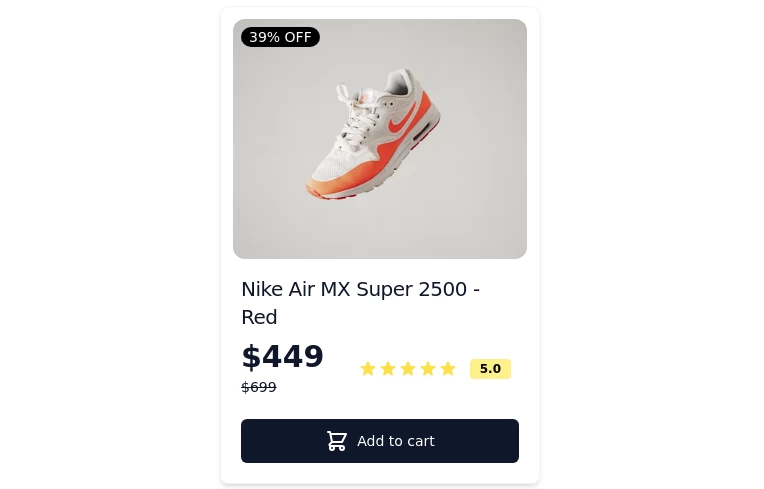 Card-Product
Item or card to show products
-
 Chat Bot
Simulation of a chat bot that can be used for conversations as a sketch idea
4.1k -
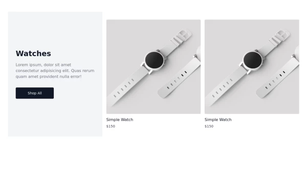 Watch Card
Watch Cards
2.6k -
-





Browse by topic
Explore components by Tags
Jump straight to the UI pattern you need.
Can't find it?
Didn't find the component you were looking for?
Search across 3,000+ community-built components and grab the code in seconds.