201+ Free Button examples in Tailwind CSS
-
 1 year ago1.1k
 -
-
 1 year ago1.7k
 -
 1 year ago1.7k
 -
 1 year ago1.9k
 -
 Tilted button on hover.
A simple button with a gradient and tilt on hover. Dark mode supported with same color.
1 year ago1.3k -
 Ripple Button
Ripple Button is an interactive button component with a ripple animation that responds to user clicks
1 year ago1.2k -
 1 year ago2.5k
 -
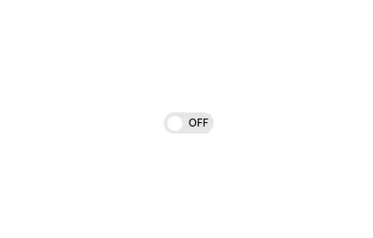 Interactive Toggle Switch with Smooth Animation
A stylish toggle switch component built with Tailwind CSS and enhanced with minimal JavaScript. This toggle switch features smooth color transitions, dynamic text ("ON/OFF"), and a moving indicator ball, providing a visually appealing and functional design. Ideal for modern web interfaces where toggling functionality is required. Easily customizable for various use cases.
1 year ago1.8k -
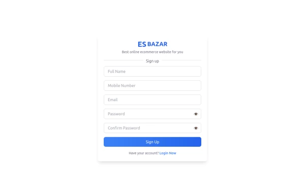 Responsive Sign-Up Form with TailwindCSS
Create a visually appealing and fully responsive sign-up form using TailwindCSS. This form includes input fields for full name, mobile number, email, password, and confirm password, along with a gradient sign-up button. Designed with simplicity and flexibility, it is perfect for modern web applications and easy to integrate into any project.
1 year ago1.5k -
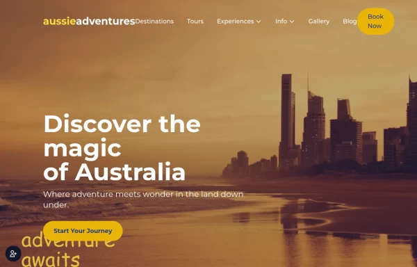
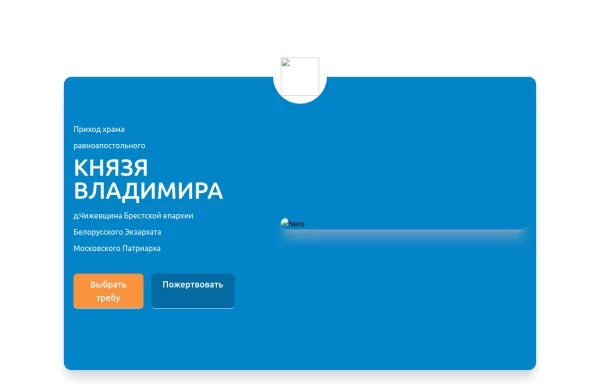 Home page 2
Отзывчивый логотип по центру. Интерактивные кнопки призыва к действию.
1 year ago915 -
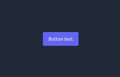
 🔥 Sleek & Modern Button with Hover Effect – Tailwind CSS
A beautifully designed button using Tailwind CSS, featuring smooth transitions, a bold shadow effect, and a hover animation. Styled with custom colors, rounded edges, and a modern font, this button is perfect for call-to-action (CTA) elements in your website or app. 🚀
1 year ago864 -
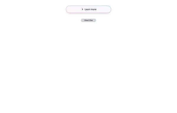 Bubblegum Button
This interactive button component is designed with a sleek gradient background and smooth hover effects, making it an eye-catching call-to-action element for modern web interfaces. Styling and Features: ✅ Gradient Background & Rounded Shape • The button container has a subtle gradient overlay (bg-gradient-to-tr) that smoothly transitions from soft pink (from-pink-300) to light blue (to-blue-300), giving it a vibrant and modern look. • Wrapped in a rounded-full container for a pill-shaped aesthetic. ✅ Floating & Shadow Effects • The shadow-lg property creates a soft floating effect, enhancing depth and visibility. • Will-change-transform optimizes animations for a seamless hover experience. ✅ Interactive Hover Animations • On hover, the inner button scales up (hover:scale-105) and lifts slightly (hover:-translate-y-2), simulating a press-and-release motion. • The transition is smooth, with a 500ms animation (transition duration-500). ✅ Content & Icon • The “Learn more” label is paired with a right-arrow icon (svg) for clear visual guidance. • The icon and text are flex-aligned (items-center flex), ensuring a balanced and responsive layout. This button is ideal for call-to-action elements, product highlights, or download prompts, offering a modern, sleek, and engaging user experience. 🚀
1 year ago1.4k -
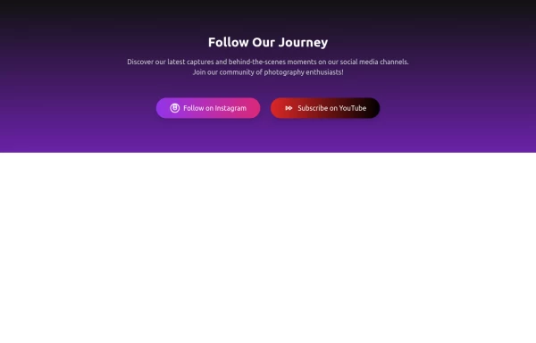 Social Share
A social media showcase
1 year ago1k -
 11 months ago2.4k


Didn't find component you were looking for?
Search from 3000+ components