🔥 Sleek & Modern Button with Hover Effect – Tailwind CSS
A beautifully designed button using Tailwind CSS, featuring smooth transitions, a bold shadow effect, and a hover animation. Styled with custom colors, rounded edges, and a modern font, this button is perfect for call-to-action (CTA) elements in your website or app. 🚀
This tailwind example is contributed by Ahita Bisma Adlula, on 27-Feb-2025. Component is made with Tailwind CSS v3. It is responsive.

Author Ahita Bisma Adlula
Related Examples
-
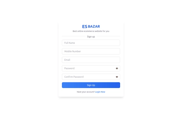 Responsive Sign-Up Form with TailwindCSS
Create a visually appealing and fully responsive sign-up form using TailwindCSS. This form includes input fields for full name, mobile number, email, password, and confirm password, along with a gradient sign-up button. Designed with simplicity and flexibility, it is perfect for modern web applications and easy to integrate into any project.
10 months ago1.3k -
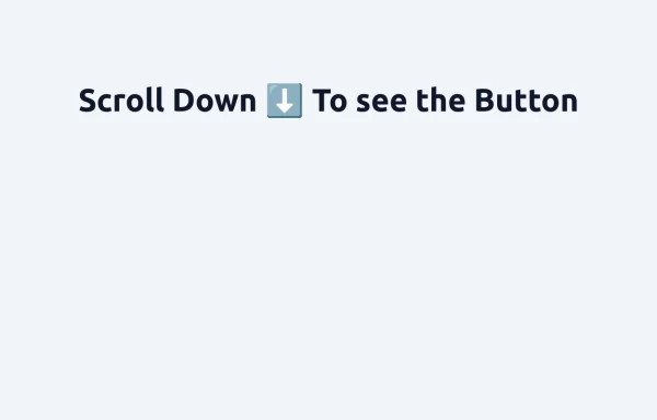 Floating "Go to Top" Button with Tailwind CSS
🚀 Boost your website’s user experience with a sleek floating "Go to Top" button! This easy-to-implement solution uses Tailwind CSS for styling. ✔️ Smooth scroll to top ✔️ Clean and modern design ✔️ Responsive and animated effects Perfect for any website or portfolio! Add it today and make navigation effortless! 🔝💻
9 months ago731 -
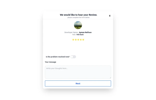 Review popup form with toggle and stars
Review popup form with toggle and stars
8 months ago709 -
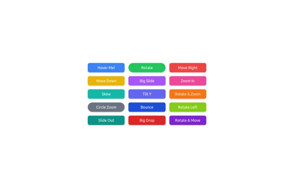
 Lots of button examples
tailwind button examples
7 months ago468 -
 button animation
button animation big
7 months ago777 -
 Life Tree
by salvator
7 months ago850 -
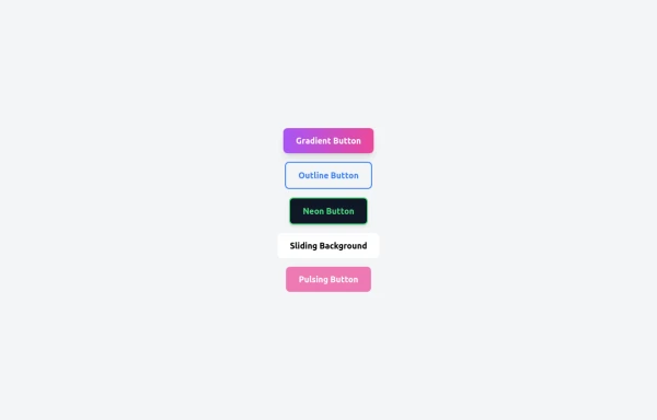 5 Different Style of Button
Gradient Button outline button neon button Sliding Background pulsing Button
5 months ago365 -
 Download App Buttons
Ready-to-use Apple App Store and Google Play Store download buttons with official branding and styling
1 month ago393 -
 3 months ago412
 -
 2 years ago18.1k
 -
 10 months ago1.1k
 -
 1 month ago427


Explore components by Tags
Didn't find component you were looking for?
Search from 3000+ components