Dismissible alert
This tailwind example is contributed by Gopi Yadav, on 14-Aug-2022. Component is made with Tailwind v3.4. similar terms for this example is caution

Related Examples
-
-
-
 Fixed alert
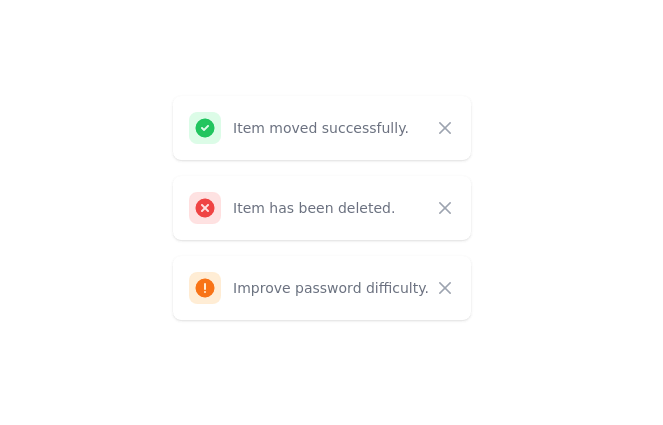
fixed top right alert
12.7k -
 12.2k
-
 Closable toast message
show notification toast message at the bottom right corner
8.1k -
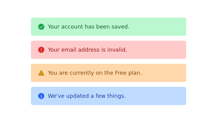
 Alert mono color
minimal alerts design
11.6k -
 12.2k
-
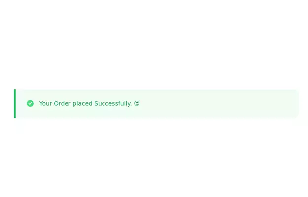
 Notification alert section
Show info, success, or error messages
11.5k -
 404 Page
The 404 Page is a responsive and customizable error page designed to inform users when they’ve reached a nonexistent or broken link. This component not only improves user experience but also provides a chance to showcase creativity and guide users back to the right path. Key Features: Fully responsive design that works on all devices. Engaging visuals (customizable images, icons, or animations). Includes a message like "Page Not Found" or "Oops! Something went wrong." Provides helpful navigation options such as a "Go Home" button or links to other pages. Easily customizable for themes, styles, and content.
3.5k -

-

-
 Beautiful Info card
Info card with info type section on the corner.
10.9k






Browse by topic
Explore components by Tags
Jump straight to the UI pattern you need.
Can't find it?
Didn't find the component you were looking for?
Search across 3,000+ community-built components and grab the code in seconds.