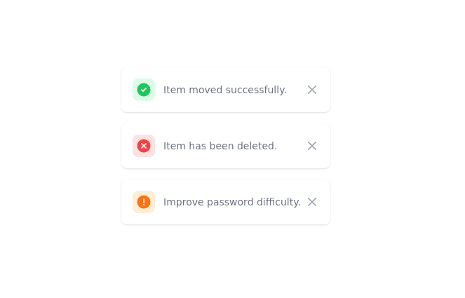
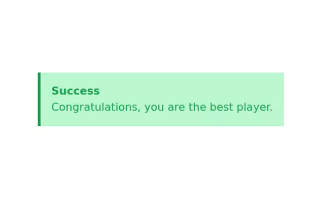
Basic alert (Success, Info, Warning, Error)
This tailwind example is contributed by Prashant, on 07-May-2023. Component is made with Tailwind CSS v3. It is responsive. similar terms for this example is caution

Author Prashant
Related Examples
-
 Toast
Toastmensajes de alerta a los visitantes de su sitio web.
2 years ago16.1k -
 2 years ago15.2k
 -
 3 years ago11.8k
 -
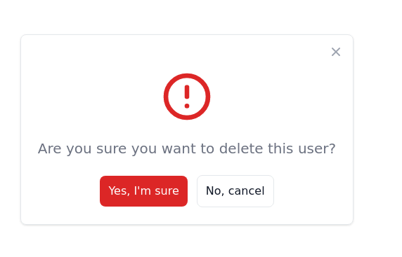
 Fixed alert
fixed top right alert
3 years ago12.1k -
 3 years ago11.5k
 -
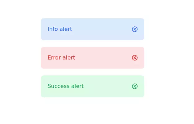
 Alert mono color
minimal alerts design
3 years ago10.9k -
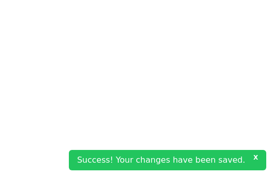 Closable toast message
show notification toast message at the bottom right corner
3 years ago8k -
 3 years ago11.4k
 -
 3 years ago11.7k
 -
 3 years ago15.8k
 -
 404 Page
The 404 Page is a responsive and customizable error page designed to inform users when they’ve reached a nonexistent or broken link. This component not only improves user experience but also provides a chance to showcase creativity and guide users back to the right path. Key Features: Fully responsive design that works on all devices. Engaging visuals (customizable images, icons, or animations). Includes a message like "Page Not Found" or "Oops! Something went wrong." Provides helpful navigation options such as a "Go Home" button or links to other pages. Easily customizable for themes, styles, and content.
1 year ago2.2k -
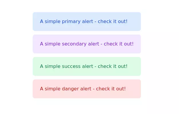
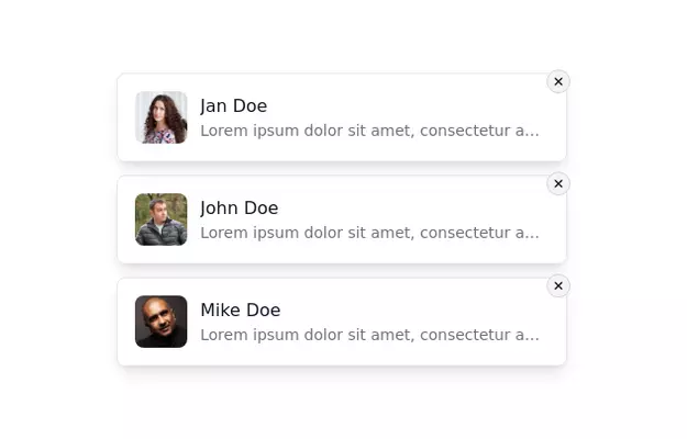 Notification Alert Section
Notification card with close button
3 years ago13.5k


Explore components by Tags
Didn't find component you were looking for?
Search from 3000+ components