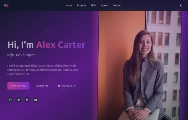
Responsive Header
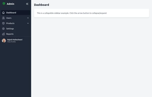
This tailwind example is contributed by Rajesh Maheshwari, on 28-Feb-2025. Component is made with Tailwind CSS v3. It is responsive.

Author Rajesh Maheshwari
Related Examples
-
 Responsive Bottom Nav
Fully Responsive bottom navigation bar with both light and dark modes
1 year ago3.6k -
 modern portifolio
by salvator
9 months ago852 -
 page heaading stacked
yeah booy, oh booy, o buy
2 years ago10.3k -
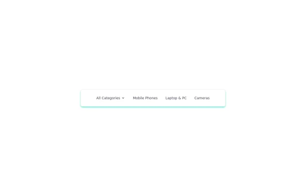
 vav bar
html , css
10 months ago1.2k -
 navigation header
responsive navigation header
1 year ago2.6k -
 1 year ago1.4k
 -
 1 year ago5.5k
 -
 8 months ago942
 -
 joker
jokerjoker cyber punk
8 months ago1.2k -
 beautifull web page
I create a web page using cloude ai its amazing.
1 year ago3.2k -
 Movies are a popular form
Movies are a popular form of entertainment that combine storytelling, visuals, and sound to create immersive experiences. They can be fictional or based on real events, spanning genres like action, comedy, drama, horror, sci-fi, romance, and more. Here’s a quick overview:
9 months ago764 -
 Navbar
This navbar implementation includes: 1. Responsive design that works on both desktop and mobile 2. Indigo-800 and Blue-900 color scheme for the background and accents 3. Dark mode support with a toggle button 4. Beautiful animations and effects: 1. Fade-in animation for menu items with staggered delays 2. Hover effects on menu items with underline animation 3. Smooth color transitions 4. Mobile menu slide-down animation 5. SVG icons for the dark mode toggle and mobile menu button 6. "Sign Up" call-to-action button 7. Mobile-friendly dropdown menu 8. Accessibility considerations (proper heading structure, color contrast, focus styles) Key features: - The background uses a gradient from Indigo-800 to Blue-900 - The navbar has a white background in light mode and dark gray in dark mode - Text colors are adjusted for readability in both light and dark modes - Menu items have hover effects with color changes and underline animations - The dark mode toggle changes its icon based on the current mode - The mobile menu slides down with a smooth animation when toggled - Desktop menu items fade in with a staggered delay for a smooth entrance - Dark mode is automatically applied based on system preferences - The layout is responsive, with a hamburger menu for mobile screens This implementation provides a visually appealing and functional navbar with various animations and effects, using HTML, Tailwind CSS, and vanilla JavaScript for the interactions.
1 year ago4.6k


Explore components by Tags
Didn't find component you were looking for?
Search from 3000+ components