Navbar
This tailwind example is contributed by Crimson, on 14-Jan-2025. Component is made with Tailwind v3.4. It is responsive.

Related Examples
-
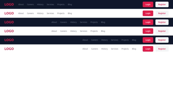 Responsive Tailwind CSS Header with Navigation & Buttons | Ready to Use
A fully responsive and modern header built with Tailwind CSS. Features a sleek navigation menu, login/register buttons, and adaptive design for all screen sizes. Open-source and easy to integrate into any web project!
2.7k -
-
 Navigation Mobile iOS
Navigation Mobile iOS
608 -
 Minimalistic navbar
Responsive navbar
21.8k -
 Navbar with Dropdown
Navbar with dropdown
1.5k -
 Responsive Navbar with TailwindCSS
responsive navbar built with TailwindCSS, perfect for mobile and desktop views
2.4k -

-
 Responsive navbar with alpinejs
A mix of Penguin navbar with PineUI Slide-Over
-

-
 Animated underline hover navbar
Simple animated underline hover effect navbar.
3.6k -
 Navbar with social links
A header component with a logo, navigation links, and social media links.
7.8k -




Browse by topic
Explore components by Tags
Jump straight to the UI pattern you need.
Can't find it?
Didn't find the component you were looking for?
Search across 3,000+ community-built components and grab the code in seconds.