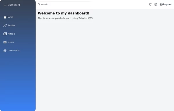
Basic Auto-Hiding Navbar
This tailwind example is contributed by Anonymous, on 14-Dec-2024. Component is made with Tailwind CSS v3. It is responsive.

Author Anonymous
Related Examples
-
 1 year ago8.2k
 -
 Best Responsive Navbar Design | Easy & Modern Navigation
Learn how to create a fully responsive navbar using HTML, CSS, and JavaScript. Perfect for beginners and developers looking for a modern, mobile-friendly navigation bar.
1 year ago4.4k -
 7 months ago824
 -
Responsive Navbar Example
A working example of the navbar
3 years ago17.2k -
 Simple navbar
semi transparent
3 years ago14.1k -
 1 year ago1.9k
 -
 Navbar with Dropdown
Navbar with dropdown
4 months ago541 -
 Animated underline hover navbar
Simple animated underline hover effect navbar.
1 year ago2.9k -
 material ios navbar mobile apple endroid
material ios navbar mobile apple endroid
2 months ago156 -
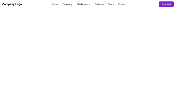
 Colourful NavBar by Itunu Ijila
Responsive Colorful Navbar with Tailwind CSS - Free HTML Template Modern, mobile-friendly navigation bar built with Tailwind CSS featuring vibrant gradient colors (purple, pink, red). Includes hamburger menu for mobile devices, smooth hover effects, and easy customization. Perfect for websites, landing pages, and web applications. Copy-paste ready HTML code with Tailwind CDN - no build process required. Fully responsive design that works on all screen sizes. Keywords: Tailwind CSS navbar, responsive navigation bar, colorful navbar template, HTML navbar component, mobile menu, gradient navbar, Tailwind navigation, free navbar template
1 month ago34 -
 2 years ago27.4k
 -
 portifolio
skills
9 months ago1k


Explore components by Tags
Didn't find component you were looking for?
Search from 3000+ components