animated hero
This tailwind example is contributed by Crimson, on 14-Jan-2025. Component is made with Tailwind CSS v3. It is responsive.

Author Crimson
Related Examples
-
 3 years ago12.4k
 -
 10 months ago1.5k
 -
 login
loginSign in page on computer screen. Desktop computer with login form and sign in button. User account. Modern concept for web
9 months ago1.1k -
 1 year ago1.2k
 -
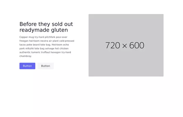
 Tailwind Hero Section
Fully Responsive Hero Section with Navbar
1 year ago5k -
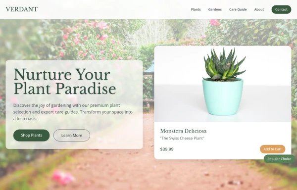 Garden
by salvator
9 months ago1.2k -
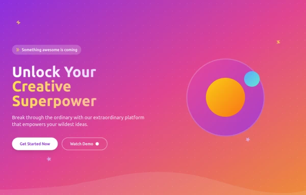
 Modern SAAS HERO Section
A hero section for your SAAS application
1 year ago2.8k -
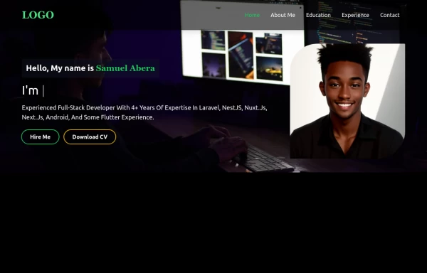 Portfolio Hero Section 2
visually stunning and captivating hero section component for your portfolio website.
1 year ago5.5k -
 2 years ago6.6k
 -
 7 months ago876
 -
 plasma 2
plasma 2
2 months ago385 -
 test
testtest
8 months ago700


Explore components by Tags
Didn't find component you were looking for?
Search from 3000+ components