Responsive Hero Section
A clean and responsive hero section built with Tailwind CSS using a flexbox layout. Features a circular profile image, two action buttons ("Say Hello" and "View Projects"), and mobile-friendly design. Includes basic JavaScript interaction with a button.
This tailwind example is contributed by Sudip chaudhary, on 04-Jun-2025. Component is made with Tailwind CSS v3. It is responsive.

Author Sudip chaudhary
Related Examples
-
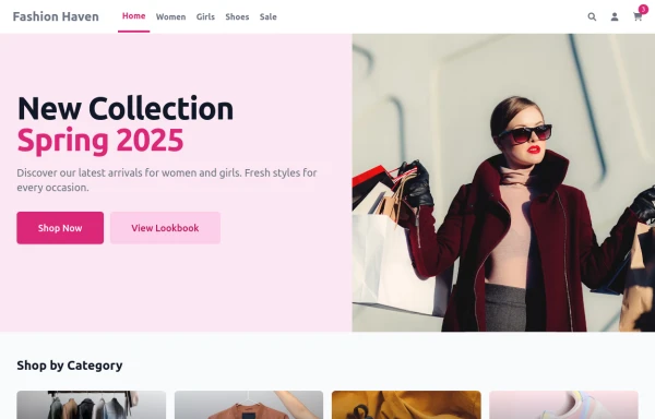 New Collection
A "New Collection" in fashion refers to a series of new garments and accessories designed and released by a designer or brand for a specific season (e.g., Spring/Summer, Fall/Winter). It's a carefully curated selection of items that typically share a common theme, style, or inspiration, reflecting the brand's identity and target audienc
8 months ago533 -
 Website Mockup
An Onyx Component. This can be used for landing pages / other website mockup purposes. It's clean design will fit with most SAAS projects.
1 year ago1.9k -
 Hero section with Big Heading
Hero banner with a gradient background, ideal for showcasing products or services. I also support dark mode.
2 years ago9k -
 Tailwind Hero Section
Fully Responsive Hero Section with Navbar
1 year ago5k -
 Hero section with large image
Hero section with large image
1 year ago4.5k -
 Landi page template
con un cuerpo libre
1 month ago66 -
 1 year ago5.9k
 -
 3 years ago12k
 -
 Free SEO Audit & Analysis Tool
Instant SEO analysis of your website. Check 50+ ranking factors including on-page SEO, technical issues, and mobile performance.
3 months ago306 -
 use-scroll-effect
use-scroll-effect
1 month ago243 -
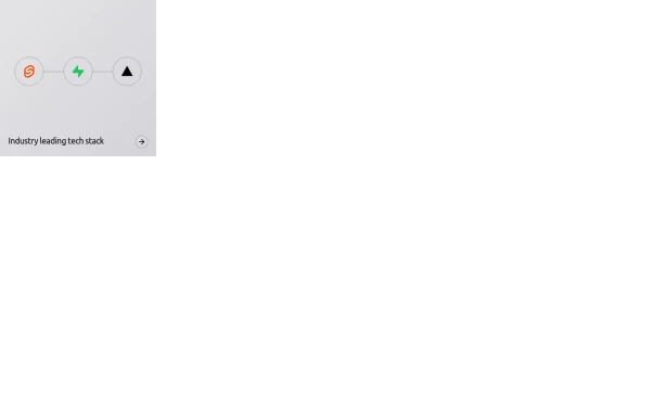 Animated bento box.
A Coastal UI component (coastalui.com). This can be used as part of a bento box, great for showing connectivity between context, could be used beyond just showing tech stacks.
11 months ago1.4k -
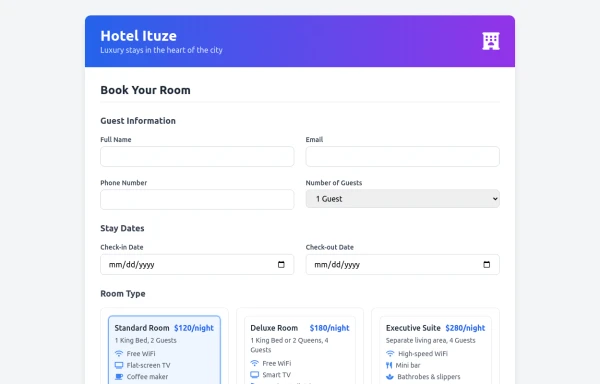 booking room or chamber
reflesh, freedom,sleeping,good vibes, etc.........
8 months ago1k


Explore components by Tags
Didn't find component you were looking for?
Search from 3000+ components