hero section
This tailwind example is contributed by SAURAV SINGH, on 13-Apr-2025. Component is made with Tailwind CSS v3. It is responsive. It supports dark mode. similar terms for this example are Product Showcase, Product card

Author SAURAV SINGH
Related Examples
-
 Product Page
Showcase for the product.
3 years ago31.7k -
 Flour mill website landing page template
flour mill and services template website which comprise of many sections like about us, featured products, why us, visit us
1 year ago13.8k -
 Product Page
Showcase for the product.
1 year ago2.2k -
 Website Mockup
An Onyx Component. This can be used for landing pages / other website mockup purposes. It's clean design will fit with most SAAS projects.
1 year ago1.7k -
 Modern Responsive Footer with Tailwind CSS
This sleek and modern responsive footer is built using HTML and Tailwind CSS. It features three sections: brand information, useful links, and social media icons. The footer includes smooth hover effects, subtle fade-in animations, and a fully responsive design that adapts seamlessly to different screen sizes. Perfect for websites looking for a professional and stylish footer section.
8 months ago1.4k -
 DailyDev Card
Card -based card used in the Dailydev Card, this is created to be modified to taste of each user
8 months ago1.6k -
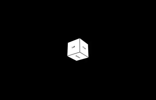 3d Box
Let's build a 3d world empowered by Orgin Dreams.these are 3d objects
5 months ago511 -
 5 months ago895
 -
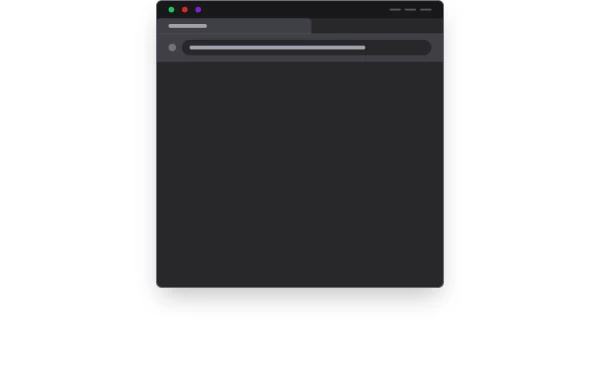
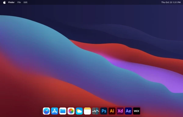 macOS Style Webpage – macOS Design in the Browser
A simple webpage inspired by the macOS interface. It recreates the clean design, dock, and desktop look of macOS using only HTML, tailwind CSS, and JavaScript. This project focuses on front-end styling and layout to bring the visual feel of macOS to the web — not a full simulation, just the look and vibe.
1 week ago175 -
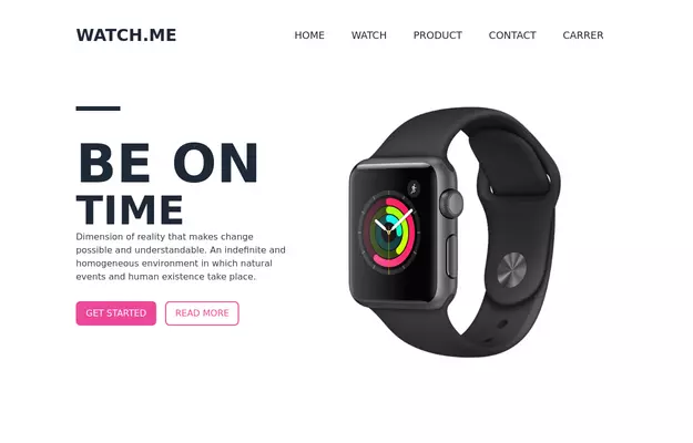
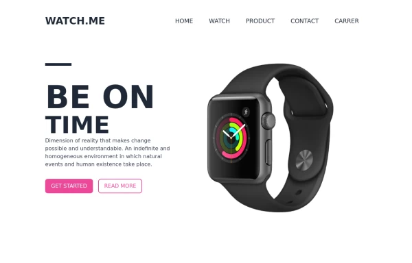
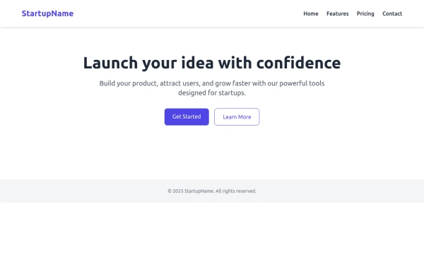
 Tailwind Hero Section
Fully Responsive Hero Section with Navbar
1 year ago4.6k -
 Game changer
by salvator
5 months ago623 -
 Responsive Hero Section
A clean and responsive hero section built with Tailwind CSS using a flexbox layout. Features a circular profile image, two action buttons ("Say Hello" and "View Projects"), and mobile-friendly design. Includes basic JavaScript interaction with a button.
5 months ago400


Explore components by Tags
Didn't find component you were looking for?
Search from 3000+ components