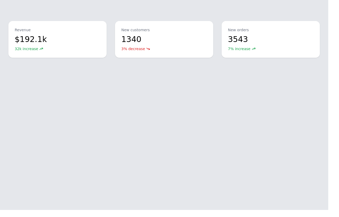
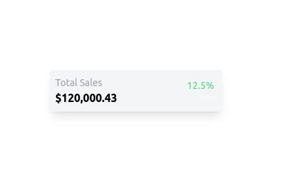
Basic stat cards
This tailwind example is contributed by Santos78, on 13-Mar-2023. Component is made with Tailwind CSS v3. It is responsive. It supports dark mode. similar terms for this example are Info, Show info, Statistics

Author Santos78
Related Examples
-
 3 years ago13k
 -
 Tailwind stat cards
Highlight key statistics
2 years ago10.7k -
 Info cards for admin panel
Display various Infos and statatics in admin panel with these cards
3 years ago12.4k -
 Responsive Info cards for admin panel
Show stats to the admin dashboard
2 years ago12.4k -
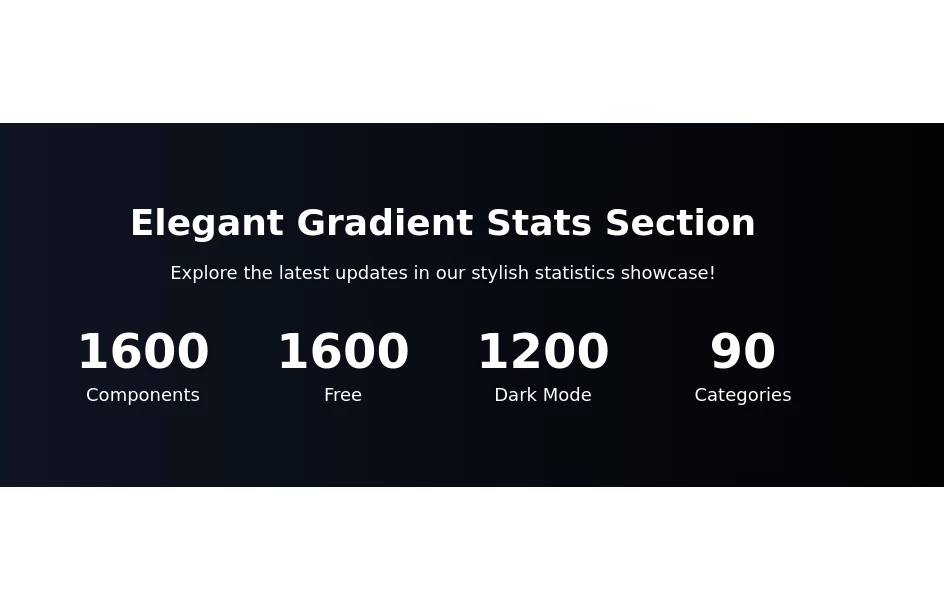
 Stats - Htmlwind
Simple stats
9 months ago838 -
 1 year ago2k
 -
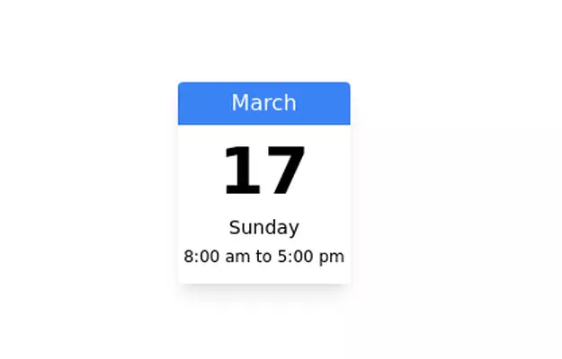 Calender
Calendar component for showing schedule
3 years ago8.5k -
 8 months ago775
 -
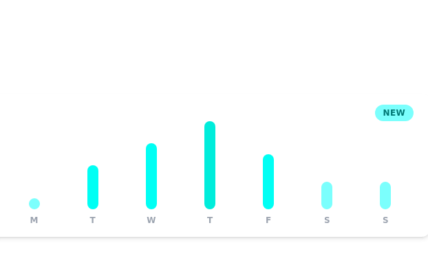 Daily growth chart
chart for showing data each day of the week
3 years ago11.4k -
 2 months ago135
 -
 Simple Kpi
This ui block is meant to be used display Key indicators on an app or website.
1 year ago1.5k -
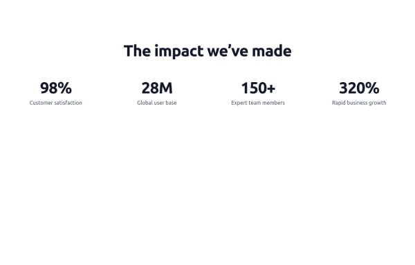
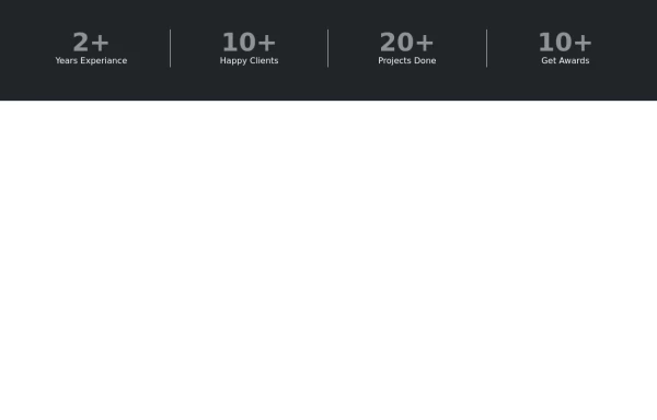 Stats or Metrics Overview
Highlight your achievements with our Stats Section, featuring key metrics such as years of experience, happy clients, completed projects, and awards. This visually engaging component effectively communicates your expertise and success at a glance
1 year ago1.5k


Explore components by Tags
Didn't find component you were looking for?
Search from 3000+ components