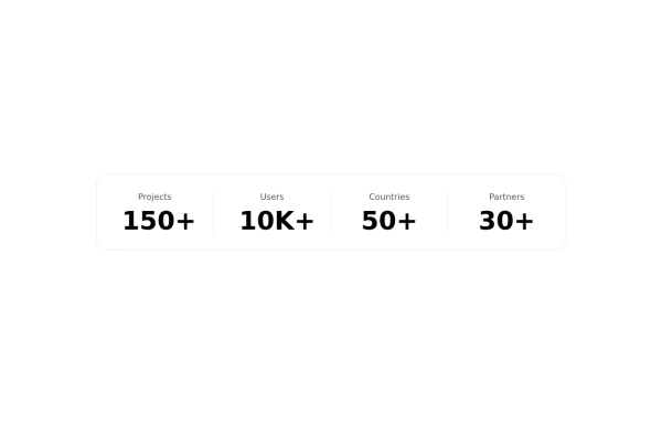
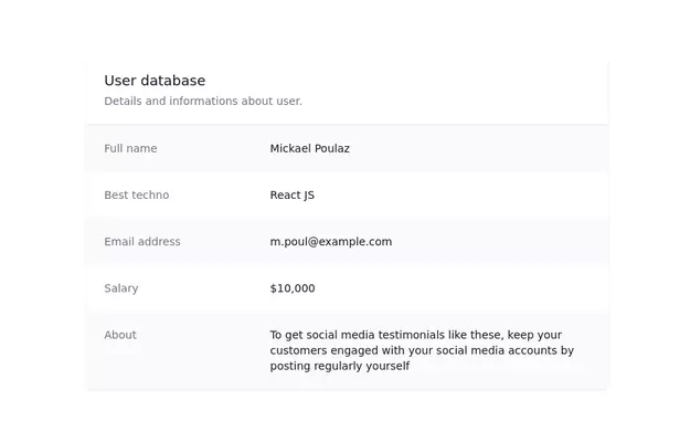
Simple Kpi
This ui block is meant to be used display Key indicators on an app or website.
This tailwind example is contributed by Ranit Saha, on 13-Jan-2025. Component is made with Tailwind CSS v3. It is responsive. It supports dark mode. similar terms for this example are Info, Show info, Statistics

Author Ranit Saha
Related Examples
-
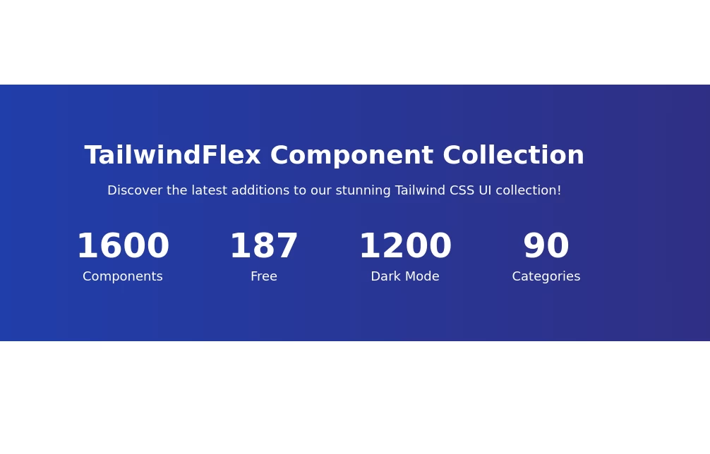
 Stats Showcase Section
Display key metrics of your product or service beautifully
2 years ago6k -
 1 year ago1.8k
 -
 Stats cards for admin panel
This Component is designed to present statistics in a tile format. It comprises a title, a large numeric value, and an icon, creating an eye-catching way to display data.
2 years ago6.9k -
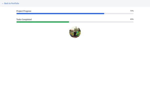 Progress Bar
A progress bar is a UI element that visually represents the completion status of a task or process. It helps users understand how much of a task has been completed and how much remains. Commonly used in forms, file uploads, loading screens, or multi-step processes, it enhances the user experience by providing clear feedback.
1 year ago1k -
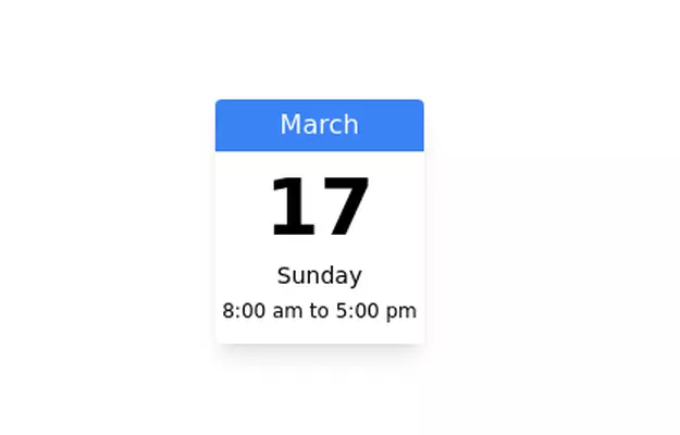 Calender
Calendar component for showing schedule
3 years ago8.5k -
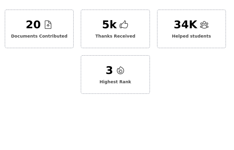
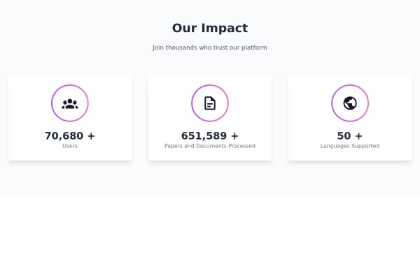 Showcase Impactfull stats
stats cards with icons
1 year ago1.7k -
 3 years ago20.1k
 -
 3 years ago20k
 -
 Info cards grid with icons
Evenly-sized cards for showing various stats on the user/admin dashboard.
2 years ago7.9k -
 3 years ago13k
 -
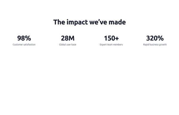
 Stats Section
The gradient background stats section uses dark shades of gradient change colors according to your website theme
1 year ago3.1k -
 Stats - Htmlwind
Simple stats
9 months ago840


Explore components by Tags
Didn't find component you were looking for?
Search from 3000+ components