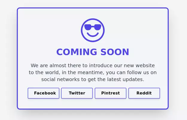
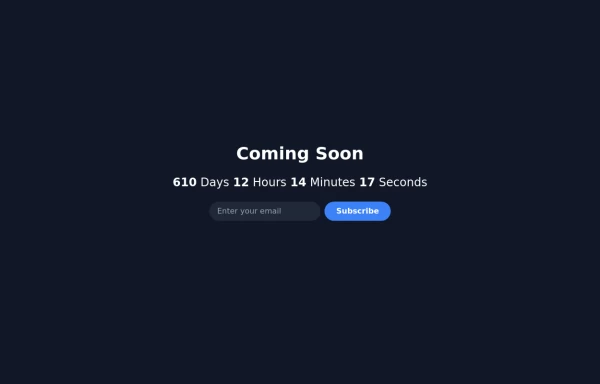
Coming Soon Section
Simple and beautiful card for your showing on your projects (in development) home screen
This tailwind example is contributed by Noob, on 29-Sep-2022. Component is made with Tailwind v3.4. It is responsive. similar terms for this example are upcoming, Pre-launch page, Teaser page, Under construction page, Placeholder page, Sneak peek page,Launch page

Related Examples
-
 10.6k
10.6k -

-
 Website Pricing List Card Component
Website Pricing List Card Component with Package Names: Basic Package → Starter Website Premium Package → Business Website Professional Package → E-Commerce Solution Pricing Structure: Increased prices significantly to reflect web development services one-time payment model FAQ Content.
1.7k -
-
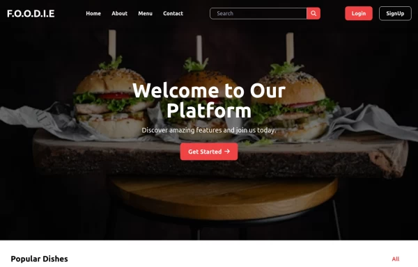
 Astro build starter template with Tailwind
Astro build starter template with Tailwind
4.5k -

-
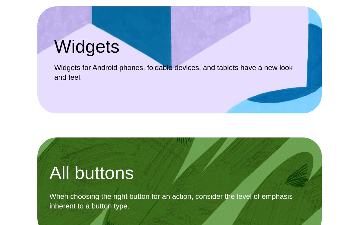 google ui cards
google ui cards
10.6k -

-
-
 Responsive Tailind css card
the best Responsive Card with image
1.2k -
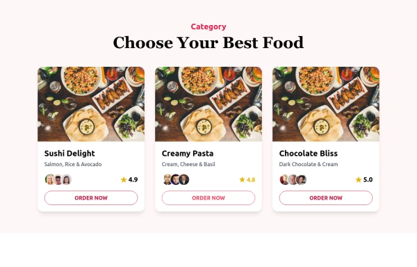 Food Ordering Dashboard
A responsive user interface for selecting and ordering your favorite meals. The dashboard allows users to browse food categories, view dish details, and place orders with ease.
-
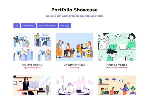 Portfolio with buttons
Portfolio with buttons. Portfolio item has image, title and description.
4.8k







Browse by topic
Explore components by Tags
Jump straight to the UI pattern you need.
Can't find it?
Didn't find the component you were looking for?
Search across 3,000+ community-built components and grab the code in seconds.