Super input radio card
card
input radio
simple input card
input design
awesome card design
rounded
black
shadow
blue
border
gray
icon
card
radio
option
HTML
CSS
select
JavaScript
dropdown
This tailwind example is contributed by ROHIT RAJPUT, on 21-Nov-2024. Component is made with Tailwind CSS v3. It is responsive. similar terms for this example is Vote

Author ROHIT RAJPUT
Related Examples
-
 Radio Buttons
Users can click anywhere on the input field to select the radio option
3 years ago16.9k -
 Card
Cardtravel place card hover effect card
10 months ago1.8k -
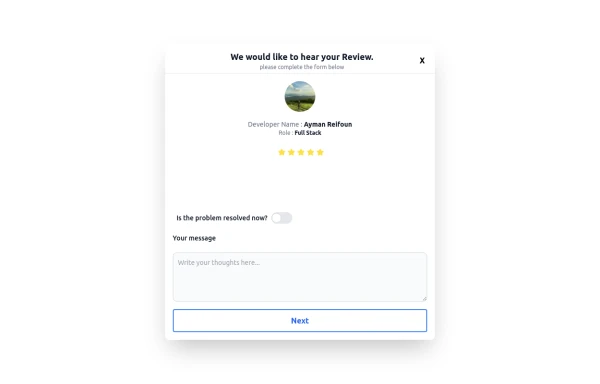 Review popup form with toggle and stars
Review popup form with toggle and stars
8 months ago712 -
 Food Ordering Dashboard
A responsive user interface for selecting and ordering your favorite meals. The dashboard allows users to browse food categories, view dish details, and place orders with ease.
7 months ago1k -
 3 years ago12.2k
 -
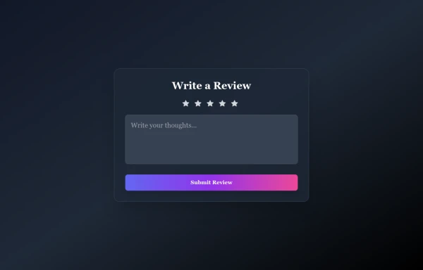 Rating Form with stars and message
tailwindcss
6 months ago491 -
 2 years ago10.2k
 -
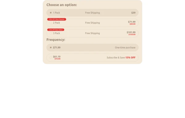
 Radio Button Group for Search Filters
set of radio buttons grouped for selecting different search filters
2 years ago5.5k -
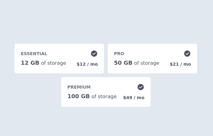 Pricing Plan Selector
radio buttons for selecting a pricing plan
2 years ago10.1k -
 7 months ago520
 -
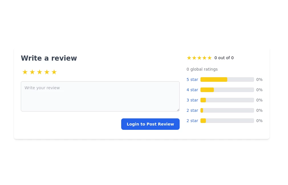 User review form
Write a review form star rating form
1 year ago2.5k -
![Material 3 Radio Buttons [Light]](https://tailwindflex.com/storage/thumbnails/material-3-radio-buttons-light/canvas.min.webp?v=9) Material 3 Radio Buttons [Light]
Material 3 Radio Buttons [Light]Radio buttons that conform to Google's Material 3 design guidelines
7 months ago638


Explore components by Tags
Didn't find component you were looking for?
Search from 3000+ components